

Designing a safety-centred decision system for the trail.
On the trail, hesitation increases risk.
Network drops. Terrain shifts. Turning back is costly. A decision cannot be postponed.
1. Navigation apps show routes, not risk.
2. GPS drift and scale distortion require interpretation.
3. Users must translate data into judgment on their own.
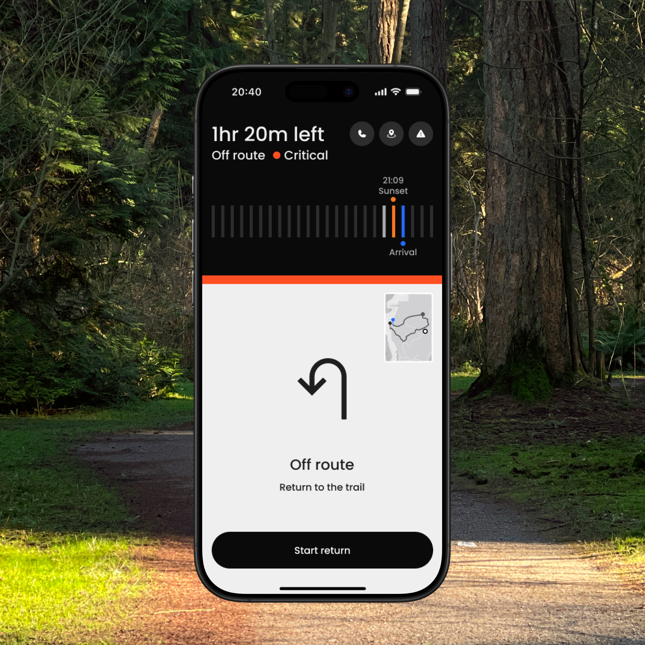
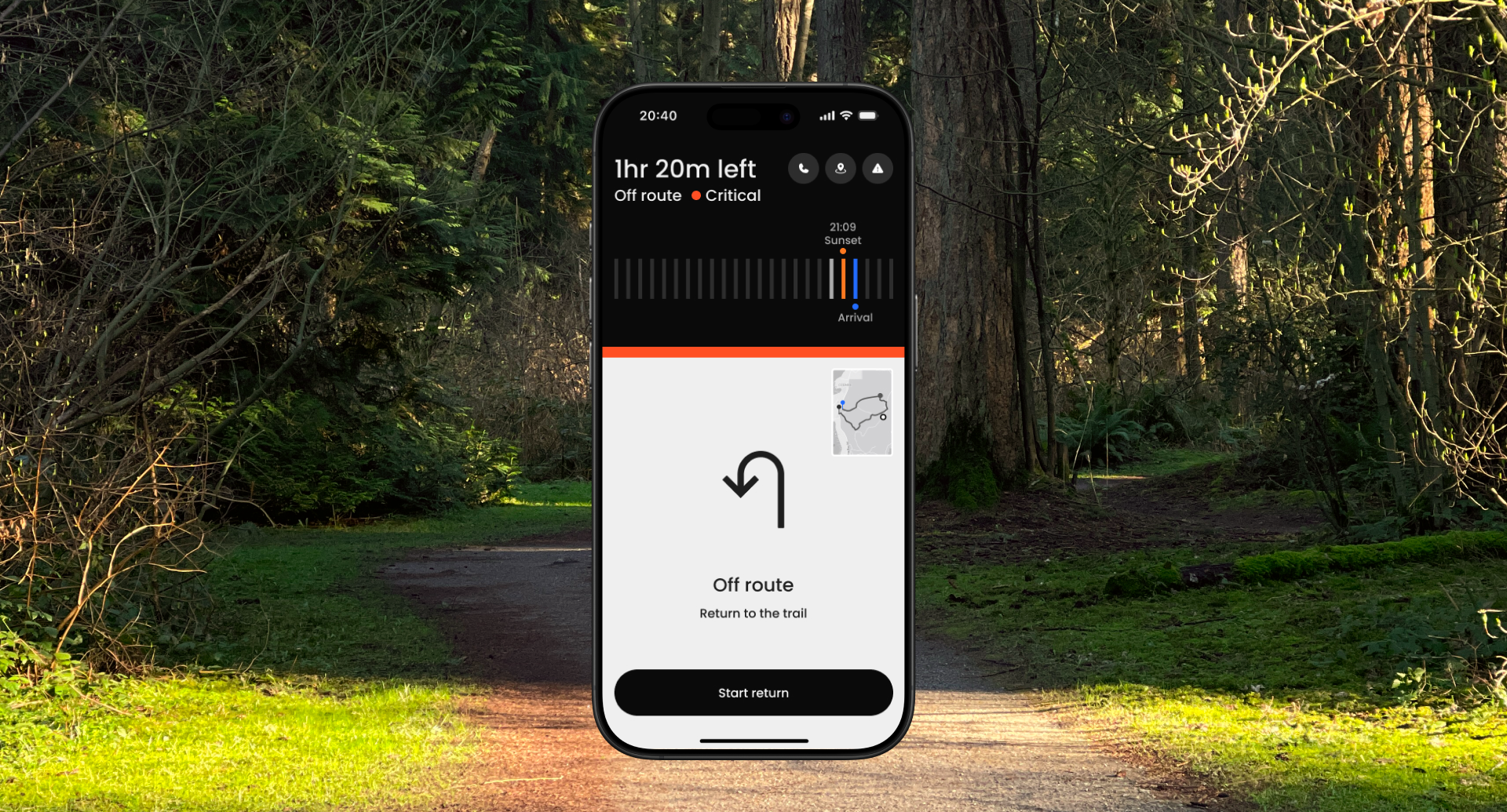
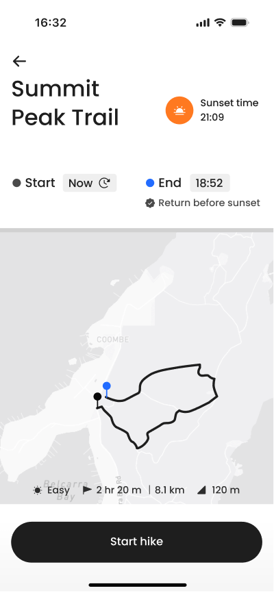
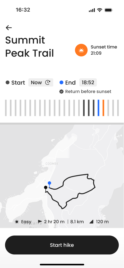
From route guidance to state awareness. Instead of prioritizing the map, the interface prioritizes the safety state.
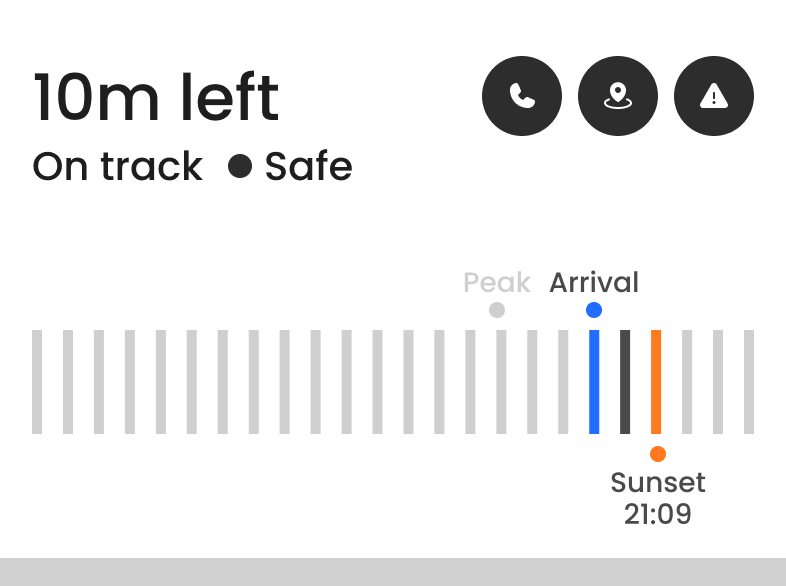
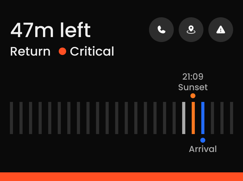
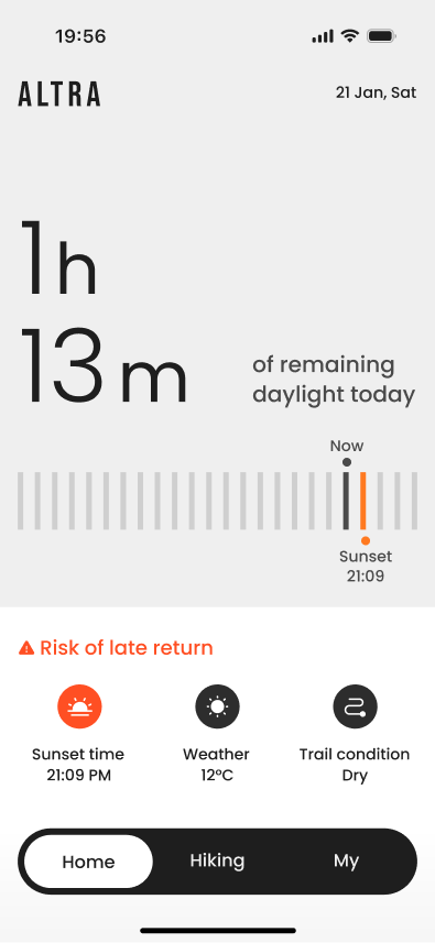
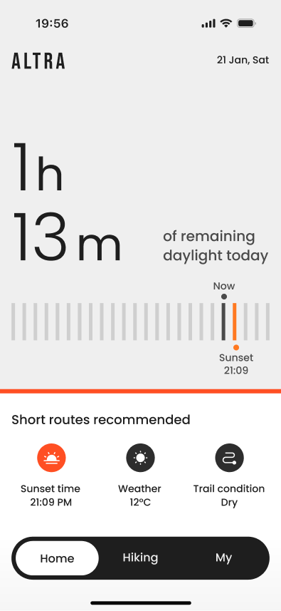
Time, estimated arrival, and environmental uncertaintyare translated into clear safety states.
Navigation becomes a safety-aware decision system.
Risk awareness increased 25% → 75%, recognition speed improved 30%.
Context
On the trail, you do not always know which direction is correct. But you still have to choose one.
They drifted off route, second-guessed their decisions, and only realized it later.
Friction
GPS is imperfect. But uncertainty on the trail does not come from precision alone.
.svg)
Understanding the behavior
Google Form questionnaire + online community review + informal peer feedback
12 beginner hikers, 3 peer hikers (ages 25–40)
multiple-choice & short answers, with casual peer conversations
Grouped recurring themes through manual clustering and pattern recognition


Designing the Decision System

Instead of focusing on the path, the interface centers on the current safety state.
.svg)
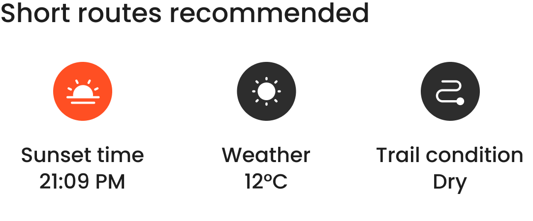
Distance, ETA, and daylight are not presented as isolated data points. They are translated into visible safety states that reduce interpretation at the moment of decision.
The Safety State Model


Translating Safety into Structure
To validate how users recognize and prioritize safety risk, I conducted three focused comparison tests.
Objective
To measure how quickly users recognize safety status.
Key Finding
recognized faster
Users identified safety status significantly faster in Version B than in Version A.
Objective
To evaluate whether spatial visualization reduces cognitive load
Key Finding
Speed vs Confidence
Numeric-only enabled faster recognition, while the proximity bar increased confidence, functioning as reinforcement rather than primary recognition.
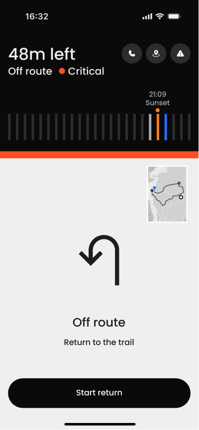
Objective
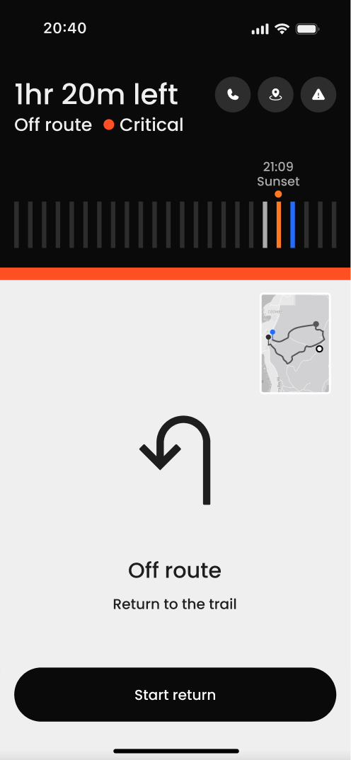
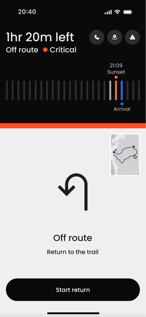
To evaluate whether constraint-based alerts align user action under critical risk.
Key Finding
Spatial Mapping Was Not Fully Understood
Only 25% recognized both risks. Most users responded to the warning without integrating the timeline relationship.
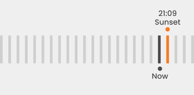
Insight from Testing
Labels made recognition 58% faster, while timelines increased confidence.
Design Direction
To preserve confidence, the next step was to make understanding faster.
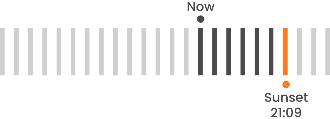
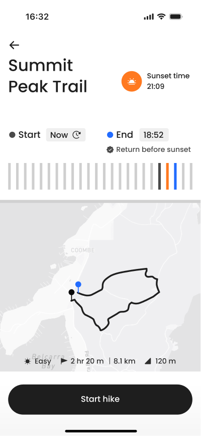
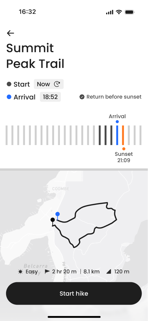
Making Time Easier to Compare
Previously, users had to look up and down to compare “now” and sunset. By aligning the markers with a natural reading direction, the comparison became quicker and more intuitive.


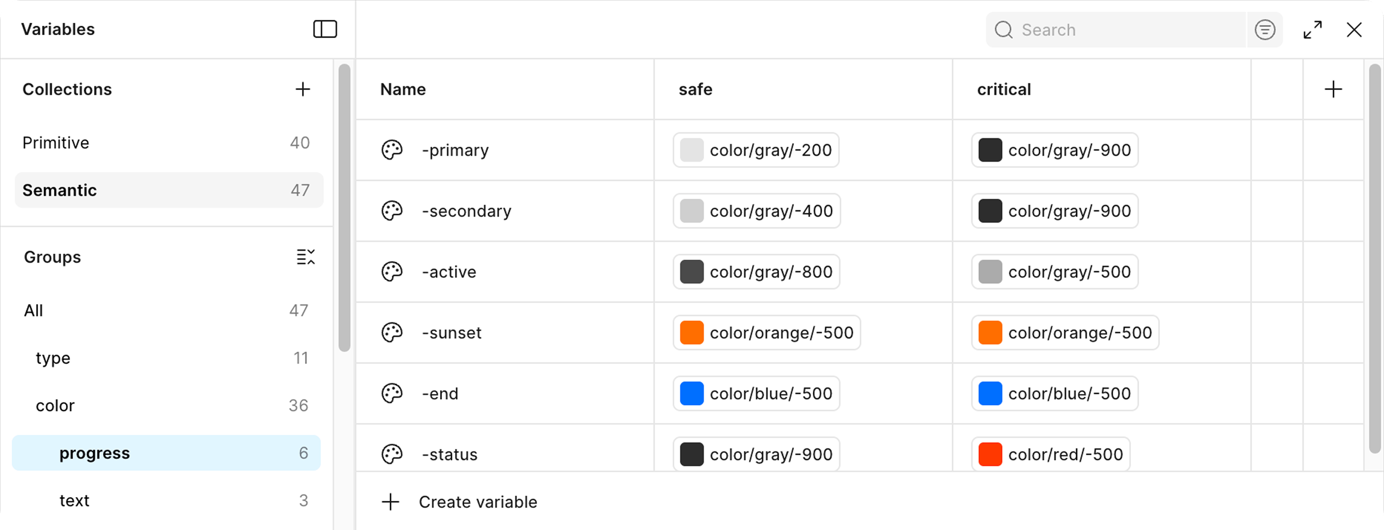
Extending the Safety Model into Design Tokens
Reflection
.svg)
In high-risk environments, speed alone isn’t enough. Hikers often make decisions alone, and uncertainty can increase hesitation. This project taught me that users need reassurance as much as quick information. Designing for safety means helping users feel confident before they act.
Safety design requires clear thresholds. Time buffers, weather limits, and trail status must be defined before the interface is built. Logic comes before visuals.
.svg)
I initially introduced three safety states. But the intermediate “Warning” state blurred decision boundaries. Reducing the system to clear, binary states improved recognition accuracy and reduced hesitation.


.svg)

