Team
4 members
Timeline
Nov-Dec 2024
Tool
Figma, Illustrator, Photoshop
Role
Designer (Branding, Research, UI Design, Prototype)
Overview

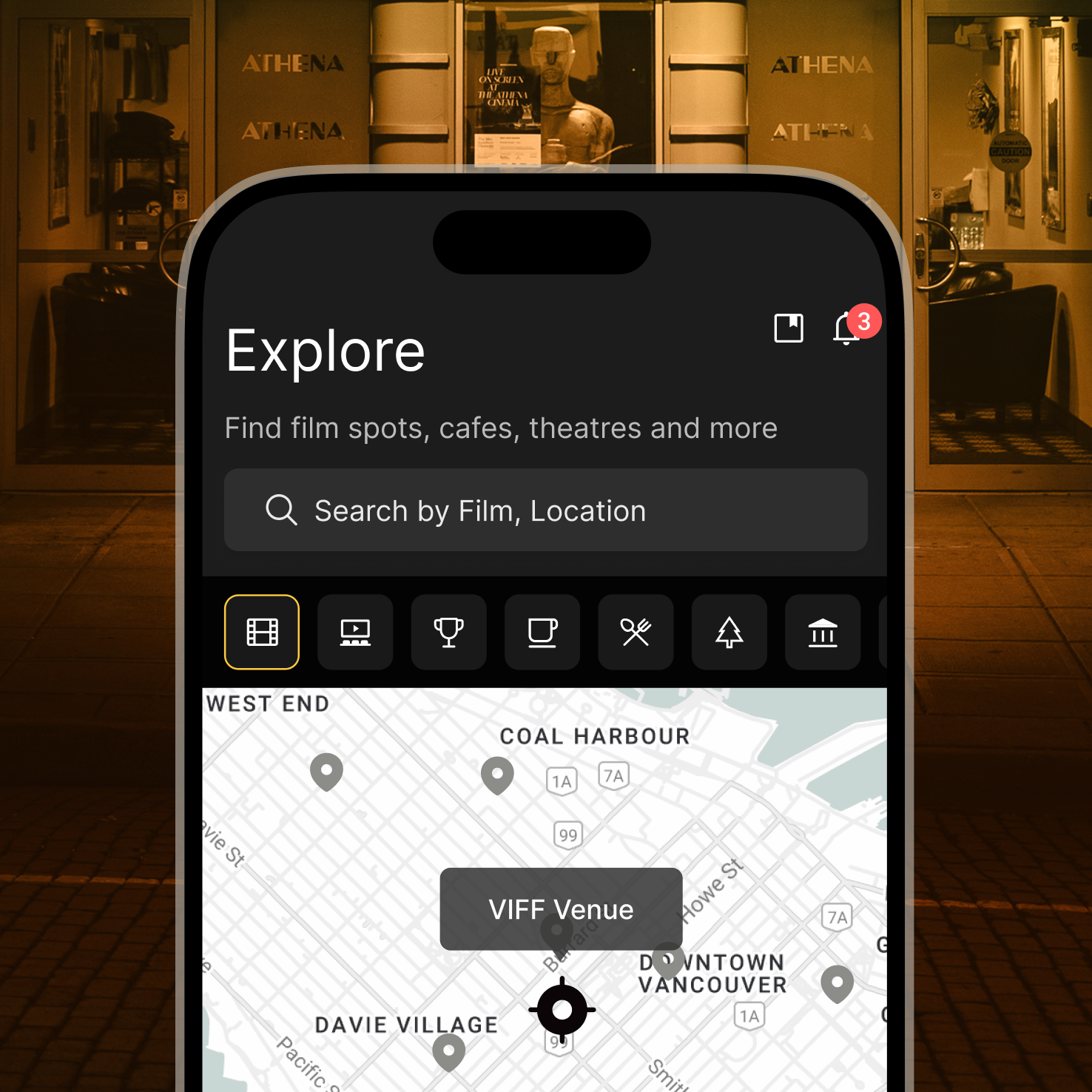
Discover real-world filming locations & manage your movie journey.

Why Bee Here?

Every year, thousands of film buffs attend festivals, visit filming locations, and explore cinematic spots inspired by the movies they love. But planning such a journey can be chaotic and unorganized, especially when it comes to saving tickets, finding exact filming spots, and managing time.

BeeHere is designed for film lovers who want to turn scattered screenings and filming locations into a seamless journey. By organizing fragmented details into a clear and visual plan, the app helps users experience cinema beyond the screen through an intuitive and story-driven UX.

PROBLEM

Too Many Films, Too Little Time

Movie buffs and festival attendees often struggle to find iconic filming locations they can visit in real life. While some information exists scattered across blogs, social media, and fan sites, there’s no reliable, centralized platform to search, plan, and navigate these spots.

Additionally, many users face challenges :


Having
limited time between screenings

📍

Dealing
with fragmented information across sources

📅

Managing
complex and overlapping schedules


Missing out
on real-time updates or interactive on-site experiences

USER INSIGHT

Google Form Survey + Casual Interviews

To understand how film festival attendees manage their time and discover filming spots, we conducted a Google Form survey with 10 VIFF participants, followed by in-depth casual interviews with 3 users. While many users enjoyed exploring film-related content, they reported common frustrations around scattered information, overlapping schedules, and lack of location guidance.

Method

Google Form survey,
1:1 interviews

Participants

10 VIFF attendees (survey),
3 users (interviews)

Format

Multiple-choice
+ open-ended questions

Analysis

Grouped user responses by common frustrations and real-life behaviors.

What we found
90%
9 out of 10
Used google Maps or Reddit to check reviews and spot recommendations.
70%
7 out of 10
Found it difficult to locate filming spots using only festival resources.
50%
5 out of 10
Found it difficult to spend time meaningfully between film screenings.
20%
2 out of 10
Had previously used a travel planning service specifically for a film festival.
“I have some downtime between screenings, but I don’t know where to go for meaningful, film-related activities.”
“Managing my festival schedule feels overwhelming, and I’m worried about missing showtimes.”
“I wish there was one app to help plan routes and find nearby filming spots easily.”
“It’s so complicated to gather all the scattered information and check details like routes or business hours.”
“Sometimes I just want recommendations for local spots featured in films, but they’re buried in random blogs.”
“Since this is both a festival and a trip, I want to visit meaningful spots that connect with the films.”

TARGET

PRIMARY

Film Festival Attendees
Movie Enthusiasts
Passionate movie lovers who seek deeper connections to their favourite films by exploring iconic filming locations and attending events like the Vancouver International Film Festival (VIFF) often combine their festival experience with city exploration.

SECONDARY

Travellers and Tourists
Visitors travelling to new cities who are also movie lovers combine their trips with discovering iconic filming spots and local culture.

USER EXPERIENCE

CHALLENGE

How might we make it easier to plan meaningful activities between film screenings?

UX GOAL

This project aimed to:
1. Help users manage time better

Support decision-making between screenings by showing meaningful routes and activities at a glance.

2. Make film exploration easier

Reduce friction by guiding users through planning with an intuitive and visual interface.

SOLUTION

1. Guided Onboarding
From Ticket to Personalized Journey

Users can easily register their film tickets and instantly explore a personalized feed with curated local content and flexible planning tools. This reduces the friction of getting started and guides users into a relevant experience with personalized context from the first step.

2. Information Overload Reduction
Enhanced User Engagement

The interface is designed to promote curiosity and interaction by surfacing personalized film-related content, event feeds, and social elements that users can engage with before and after screenings. A cinematic mood is carried throughout the app, creating a cohesive and immersive experience.

3. Visual Planning Schedules
Streamlined Planning Flow

Users can easily switch between itinerary and timeline views to balance film screenings with nearby activities. This reduces planning stress and helps craft a more seamless, personalized festival experience.

DESIGN DECISION

Where scattered content became structured guidance. This is how user feedback shaped a more intuitive planning experience.
From Ticket to Personalized Journey
Visuals Helped Users Predict What to Do Next

Most users immediately recognized the ticket registration area without needing to read the instruction.This led to faster interaction and less hesitation, confirming both visual clarity and functional affordance.

Before
After
Recognition rate increased when visuals implied the next action rather than explained it.
Before
After
Most users found the new layout more suitable for planning thanks to clear CTAs and balanced visual hierarchy.
Before
After
Recognition rate increased when visuals implied the next action rather than explained it.
Enhanced User Engagement
Clear Visual Hierarchy Enhanced User Focus

User feedback revealed that the combination of cinematic branding and clear visual hierarchy created a smoother and more emotionally engaging experience. Users felt more confident navigating the interface and often located key actions without hesitation.

Before
After
By combining a cinematic visual tone with grouped content and consistent icons, users could easily identify and act on key features
Streamlined Planning Flow
Plan with Side-by-Side Comparison

The redesigned planning interface lets users create and compare multiple schedules with ease. Clear visual structure and distinct icons help users understand each plan quickly, making it easier to choose the best option without confusion.

Plan 1
Plan 2
Plan 3
Viewing multiple options helped users explore variations and choose the best one.
Plan 1
Plan 2
Plan 3
Each plan clearly showed what was added and where, helping users visualize the route and organize their schedule at a glance.

PROCESS

Low-Fidelity Wireframes

The initial wireframes focused on mapping out the core features and overall user flow. This stage helped visualize key screens early and define the app’s structure before adding visual detail.

Mid-Fidelity Wireframes

The mid-fidelity wireframes were initially created by a teammate based on our early structure. Through collaborative discussions and user testing, we identified areas for improvement.

Many users found the layout difficult to read and struggled to make plans due to the unclear hierarchy. Additionally, the intended cinematic brand mood wasn’t fully reflected.

I led the redesign to improve readability, support clearer planning, and bring stronger alignment with our brand direction.

High-Fidelity Wireframes

Key UI elements were refined based on insights from mid-fidelity user testing. Improvements focused on enhancing visual hierarchy, clarity, and intuitive interaction.

FINAL UI

Explore the App

KEY TAKEAWAY

I learned that in film-inspired experiences, visuals guide users more effectively than text.
During this project, I realized that users tended to ignore written instructions and instead relied on visual cues to navigate. By shifting to a more visual-first UI, the planning flow became more intuitive and natural. Using imagery, visual hierarchy, contrast, and mood proved to be more effective than lengthy explanations in guiding users through the experience.

As a UI/UX designer, this taught me the importance of designing with user behaviour in mind. It is not just about how things look but how they are perceived and used. This experience showed how visual design can support usability, especially in emotionally driven or cinematic contexts. It reinforced my belief that effective interaction design should feel effortless and guide users with clarity and emotion.