PROBLEM
Items like batteries, electronics, and lightbulbs require special recycling rules. However, most people don’t know what to do with them. With unclear instructions and no single place to check, these items are often stored at home or thrown away by mistake.

USER INSIGHT
To quickly validate the problem, I gathered feedback from friends, classmates, and online posts in Vancouver recycling communities. Most people were confident about standard recycling (paper, plastic), but confused when it came to special waste like batteries, electronics, and expired lightbulbs.Even people who cared about sustainability didn’t know where to check, or admitted they were just keeping things in boxes at home for months.
Casual peer interviews
5 Vancouver residents
(ages 20–45)
Open-ended Qs, chat-style conversations
Grouped common pain points by emotional response to uncover UX opportunities.
“Not sure how to recycle batteries… I’ll figure it out later.”
“Is this recyclable? I don’t know, better not risk it.”
“I wanted to recycle but gave up because it was too complicated.”
USER EXPERIENCE


CHALLENGE
How might we help users quickly figure out where and how to recycle tricky items through a simple scan?
UX GOALS
Reduce hesitation by creating a seamless experience from scan → categorization → next steps. Users should always know what to do next.
Make disposal instructions clear and accessible. Help users quickly understand how to recycle tricky items without needing to decode technical terms or search elsewhere.
SOLUTIONS

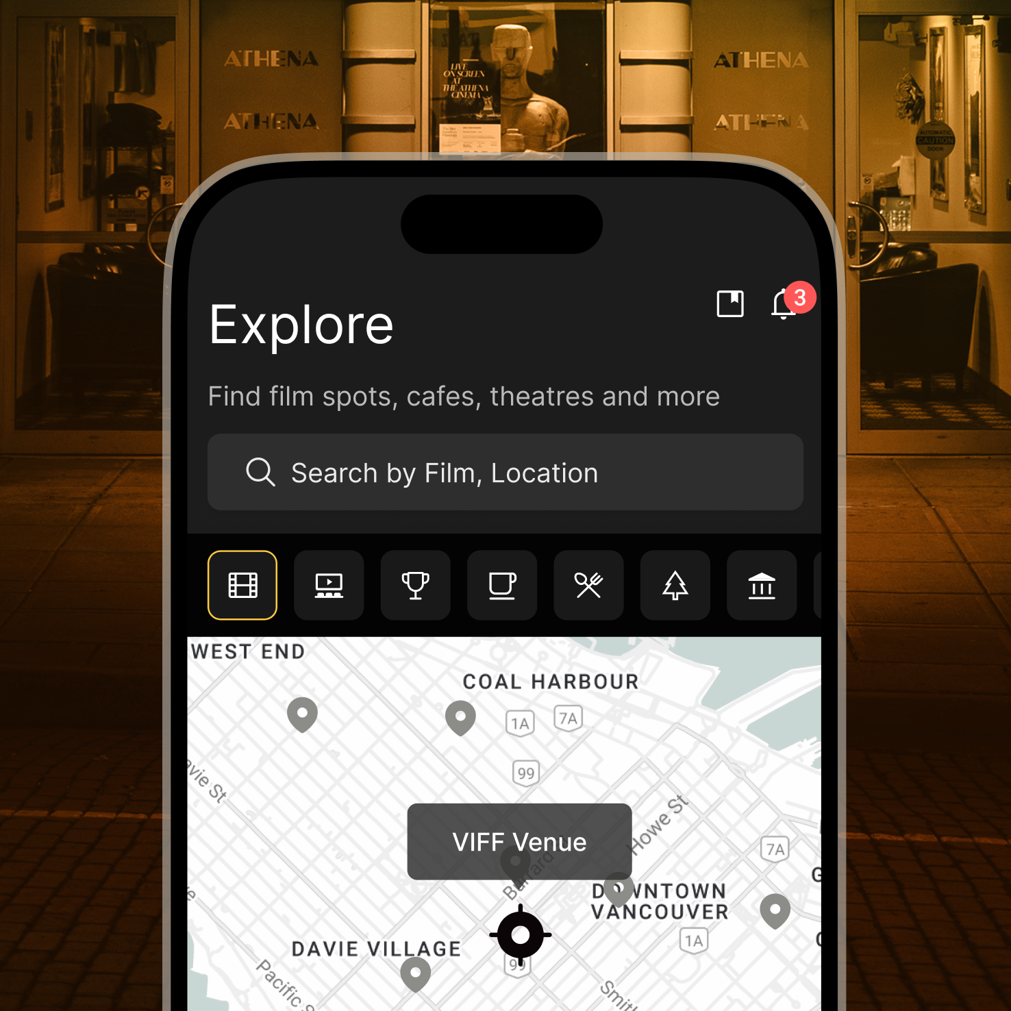
To reduce friction for first-time users, this flow allows individuals to scan mixed waste items using their phone camera. The AI instantly identifies each item as recyclable, hazardous, or electronic waste, eliminating the need for manual input or category knowledge.
The design provides visual labeling after scanning, allowing users to interact directly with each detected item to explore disposal methods and nearby drop-off locations.

WIREFRAME
To quickly visualize the user journey and key screens.

To test the overall flow and user actions without visual styling.

In the final design, I focused on creating a simple and clear interface that feels usable for anyone.Since the audience is defined by purpose, not age, I prioritized accessibility with large buttons, intuitive icons, and color-coded categories.The minimal layout helps users take action quickly and confidently.