
About Velot
Bringing Professionalism to Everyday Mobility
Cars are meant to bring convenience, but for some, they take away time and add unnecessary hassle. VELOT was created to make daily mobility more efficient. From the moment you start driving to the moment you park, we simplify every step so you can focus on what truly matters.
Brand Story

Make mobility effortless. We design every step of the journey for less stress and more freedom.
A smarter way to move. Shared mobility and parking solutions that save time, space, and the planet.
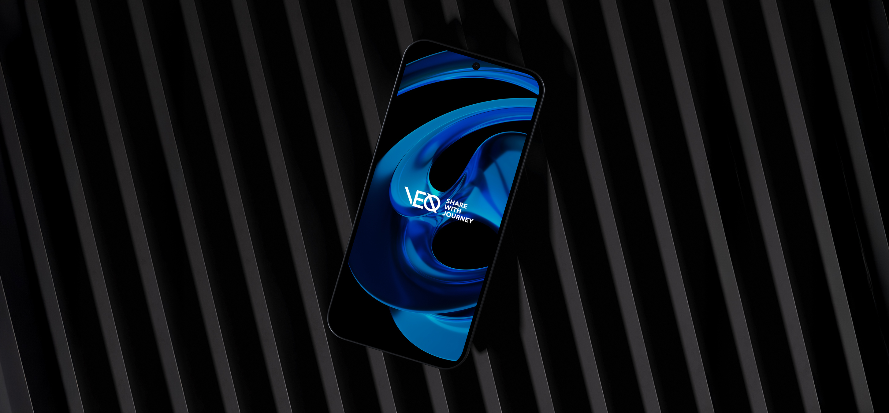
Logo
The VELOT logo is built from visual cues found in the driving experience, such as parking lines, curved roads, and overlapping lanes. The geometric cuts and circular intersection reflect the brand’s focus on flow, structure, and movement.
The logo also adapts across contexts, from a full form to a simplified version, reflecting the brand’s flexibility in everyday mobility.
Concept
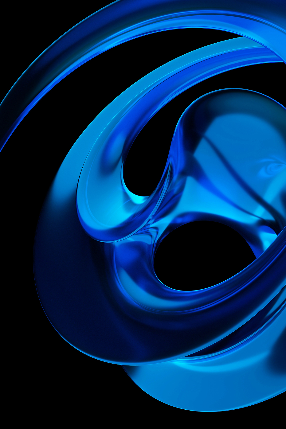
The flow between motion and rest
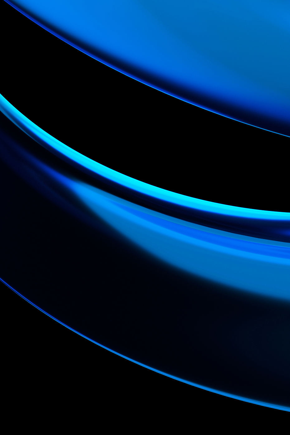
The seamless transition between driving and parking is visualized as a design motif. Inspired by urban mobility patterns, the concept blends movement and pause to reflect Velot’s role in optimizing everyday journeys, from your starting point to your destination.

Mood
Modern & Sleek Flow
The moodboard conveys a sense of modern precision and smooth flow through glass textures, metallic tones, and directional light. It expresses a refined balance between movement and calm stability.

Design System
Velot’s palette expresses clarity, confidence, and motion. Deep Black conveys control, Signature Blue drives energy, and Soft White adds balance and lightness.
The typography balances motion and calm, staying clear and steady to reflect quiet confidence.

These visual motifs are derived from the core concept, “The flow between motion and rest,” translating it into a fluid and cohesive visual language.

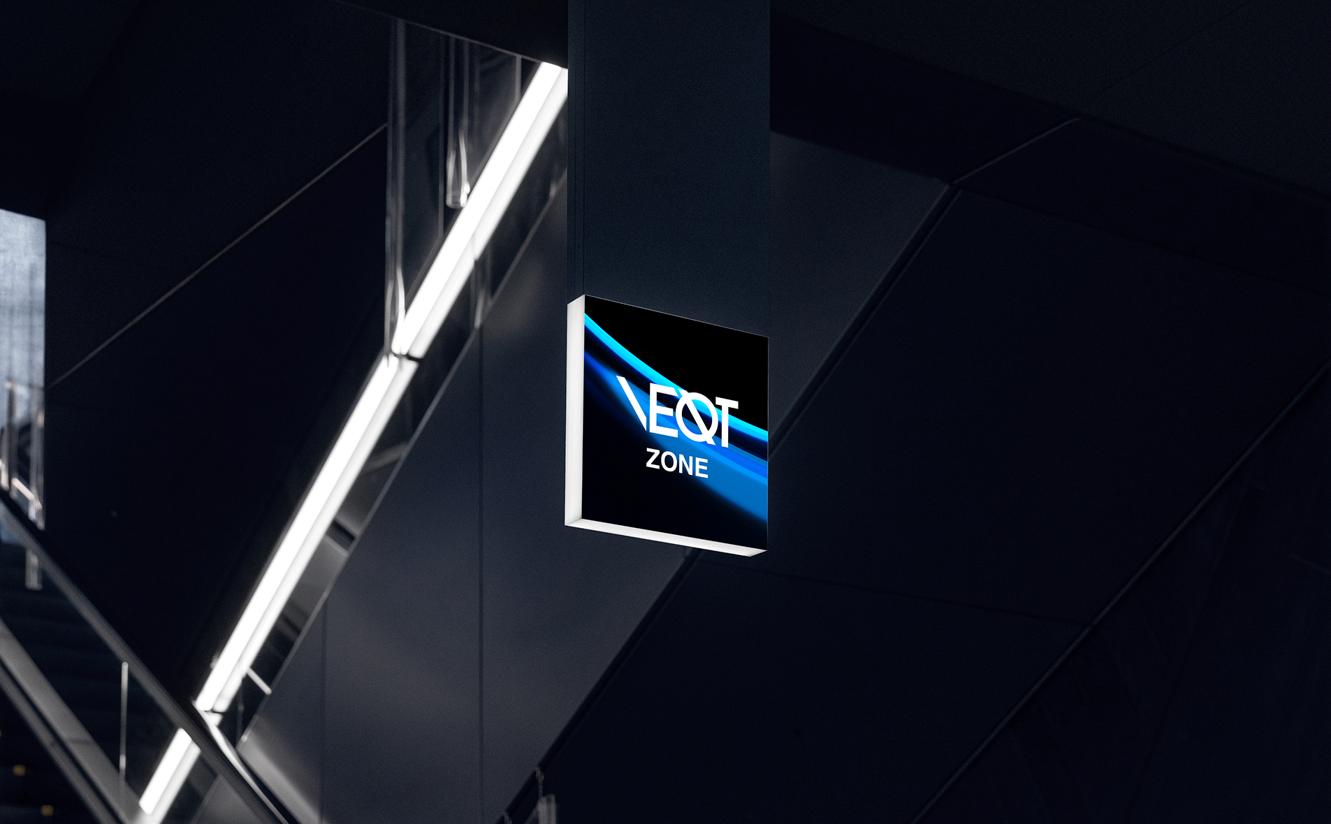
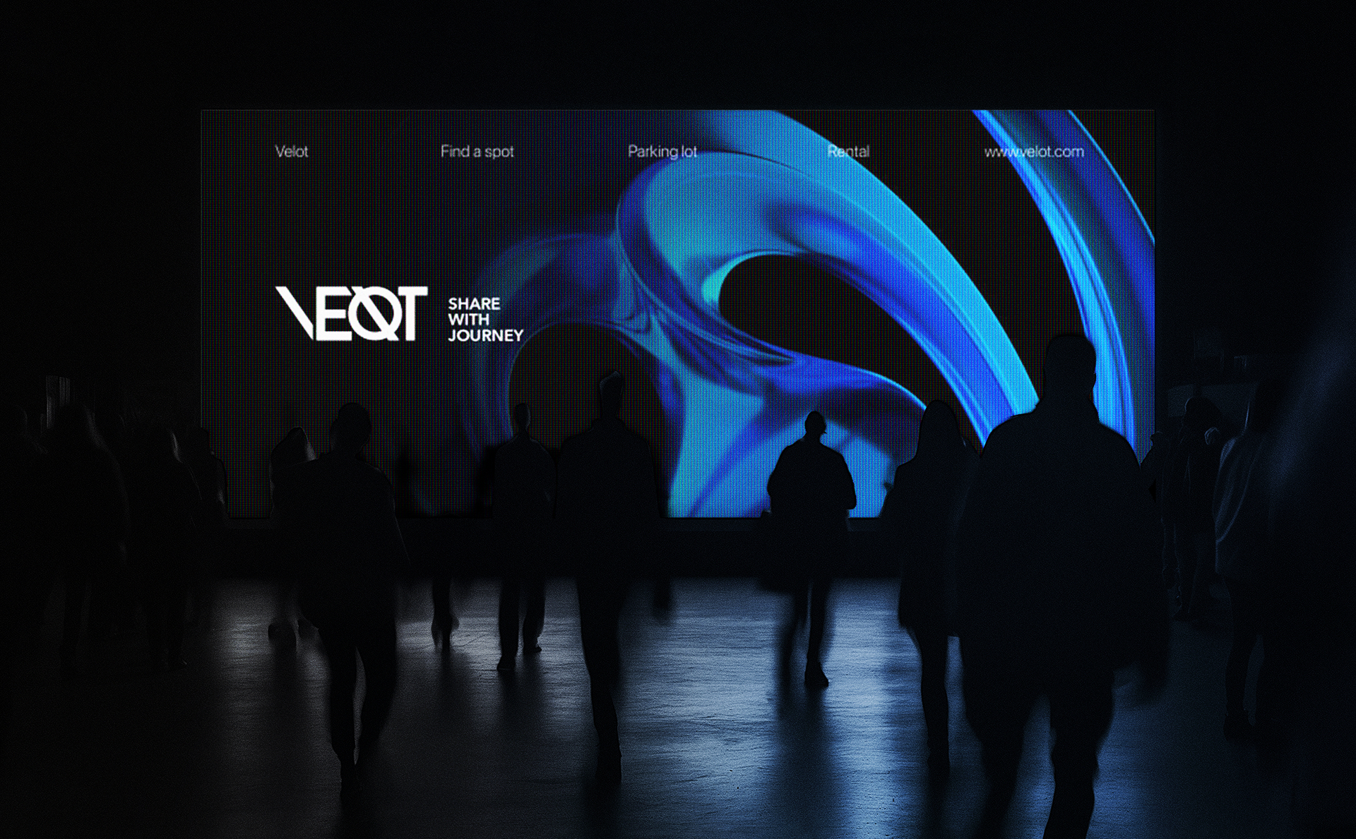
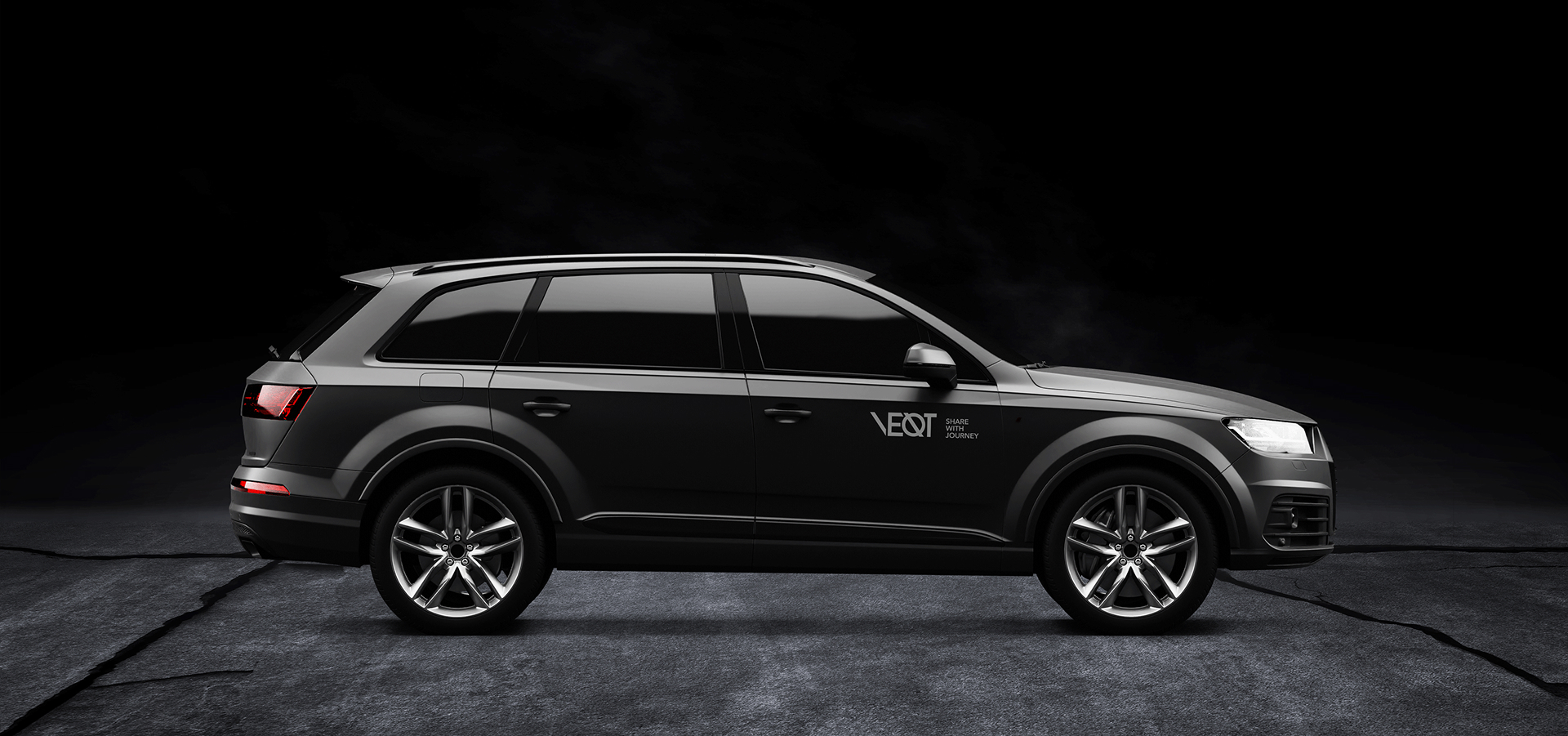
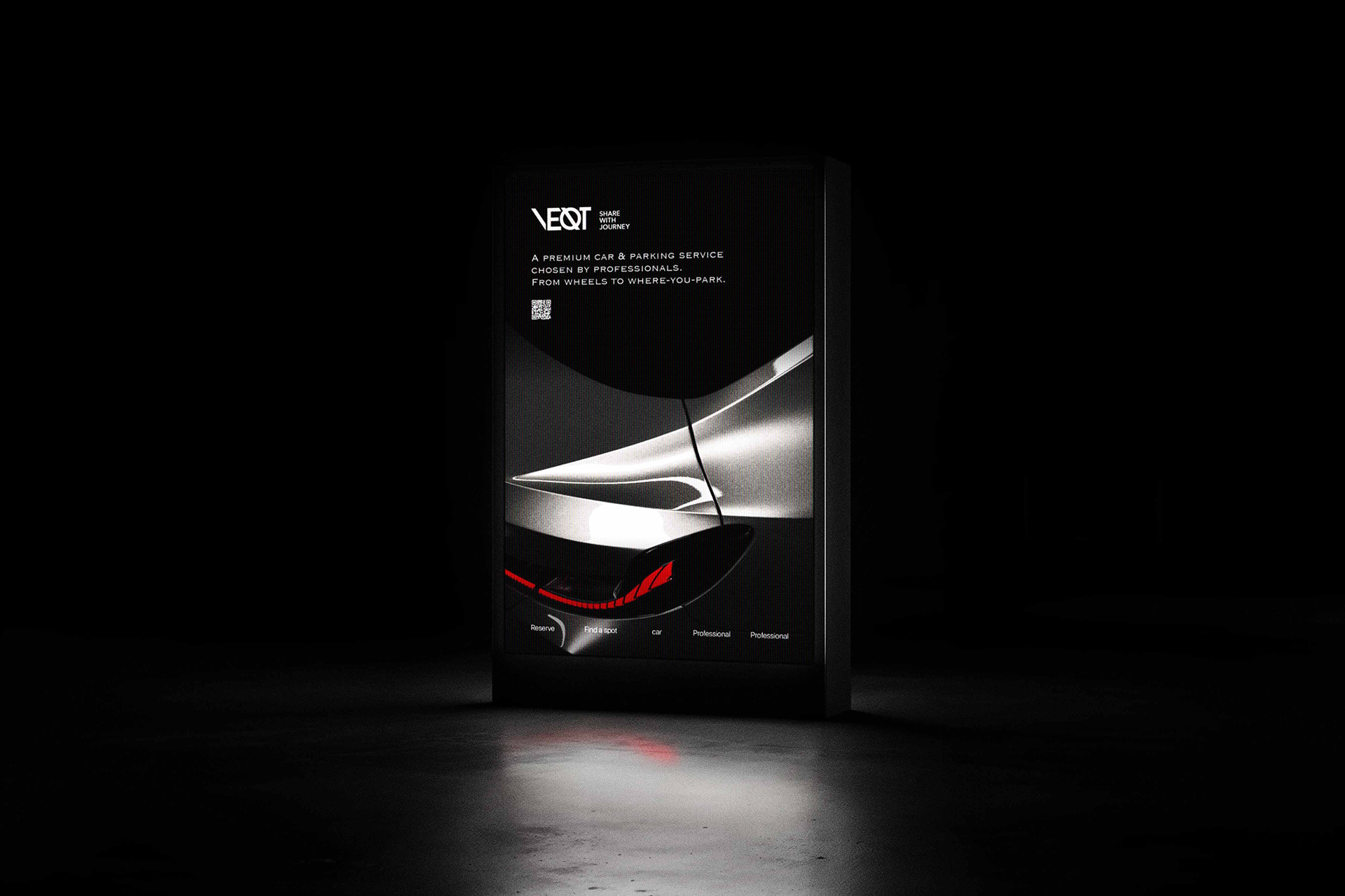
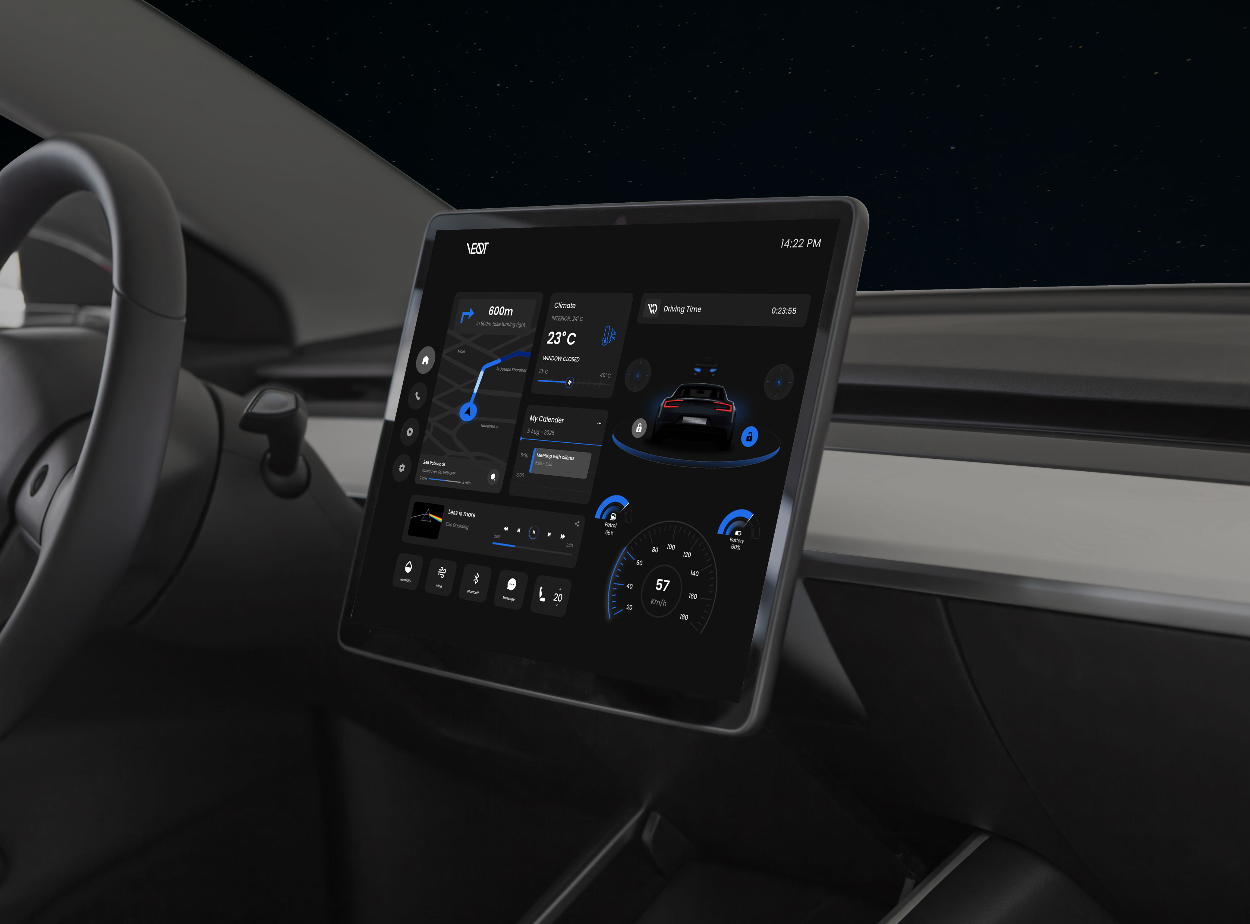
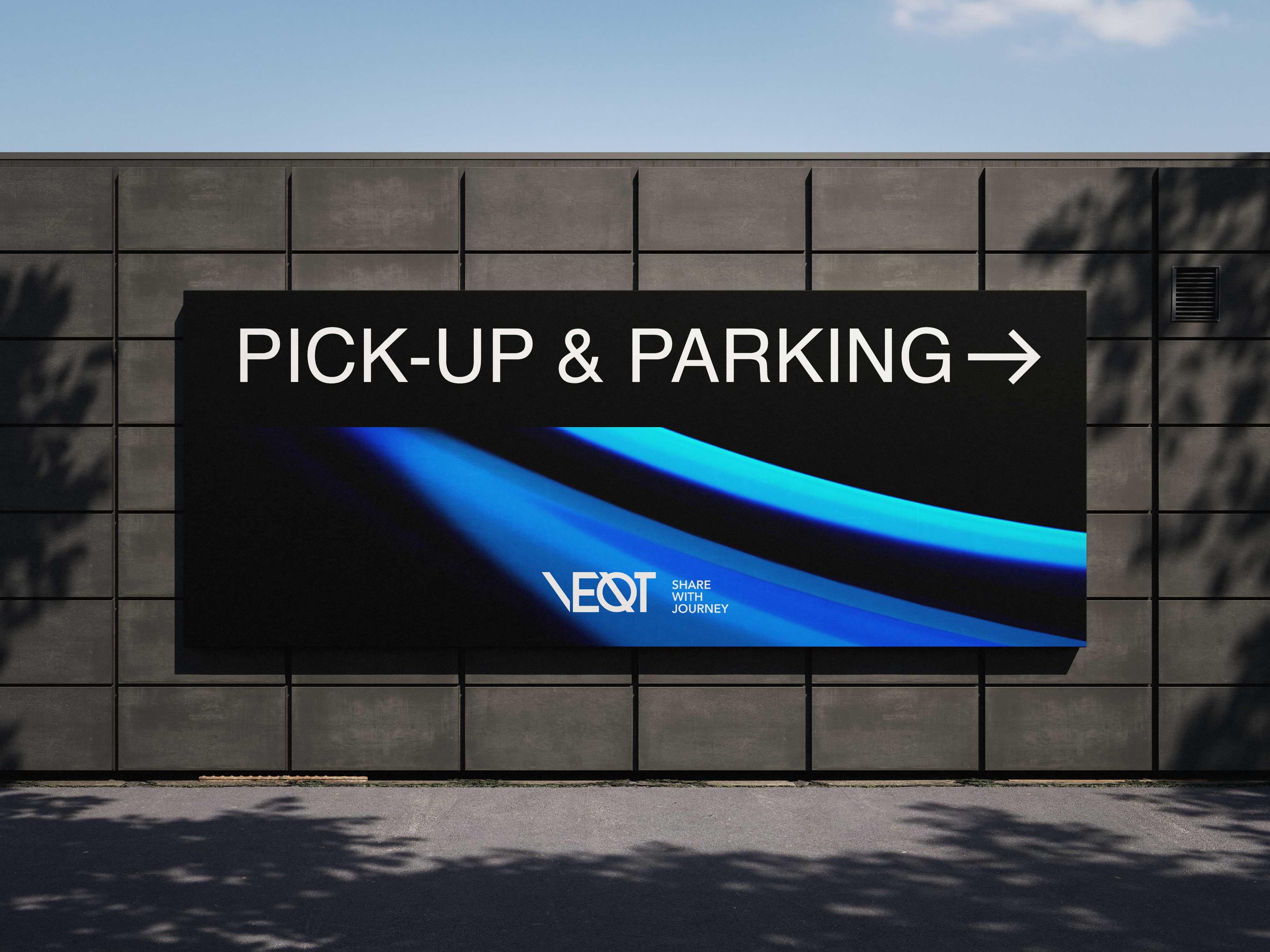
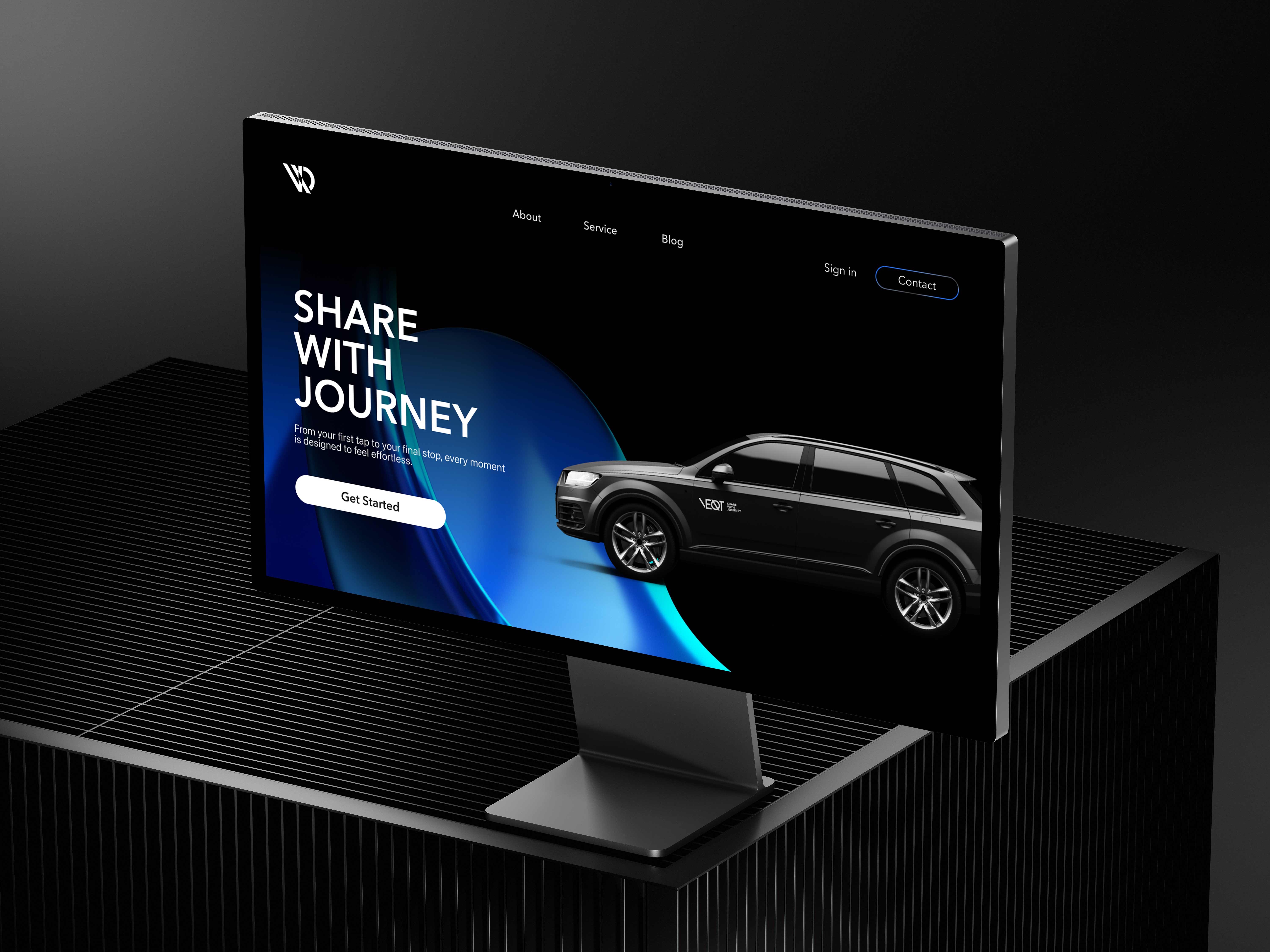
Brand Applications

Reflection
Branding is not just visuals. It’s about creating an experience.
At first, I added multiple text elements to make the brand’s message clear. But the more I added, the less refined it looked. Once I removed those details, the design felt more cohesive and elevated.
I realized that true luxury is expressed quietly, not by labelling something as “luxury” or “professional,” but by showing it through simplicity and consistency.