Problem
Teams lose time and money because subscription details, renewal dates, and member access are scattered across multiple tools.
Challenge
How can we enable small teams to instantly manage their spending through a conversational interface, while ensuring design-to-development alignment for a scalable system?
Solution
A chat-based subscription management system powered by Gemini AI that centralizes spending, tool ownership, and member access through natural conversational flows.
Outcome
A functional MVP built in 24 hours at StormHacks 2025, followed by two weeks of design system architecture and high-fidelity UX refinement to ensure long-term scalability.
Context
99% of people I surveyed experienced unexpected extra charges because they forgot subscription renewal dates. This showed how common and costly subscription mismanagement is, especially for small teams.
Problem
Subscription details, renewal dates, and tool ownership are scattered across multiple places, making it hard for small teams to stay organized and avoid unnecessary costs.

Understanding the problem
.svg)
Renewal dates are hard to track
.svg)
Renewal dates are hard to track
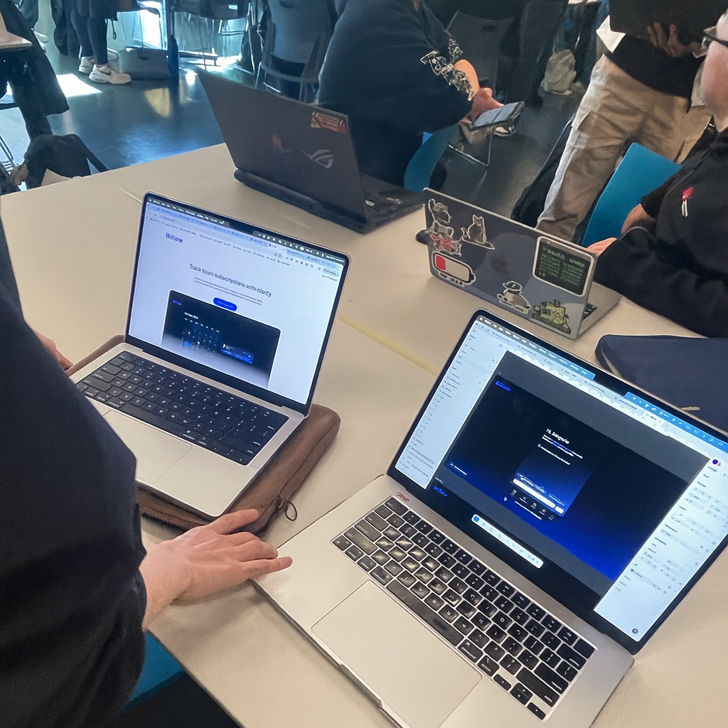
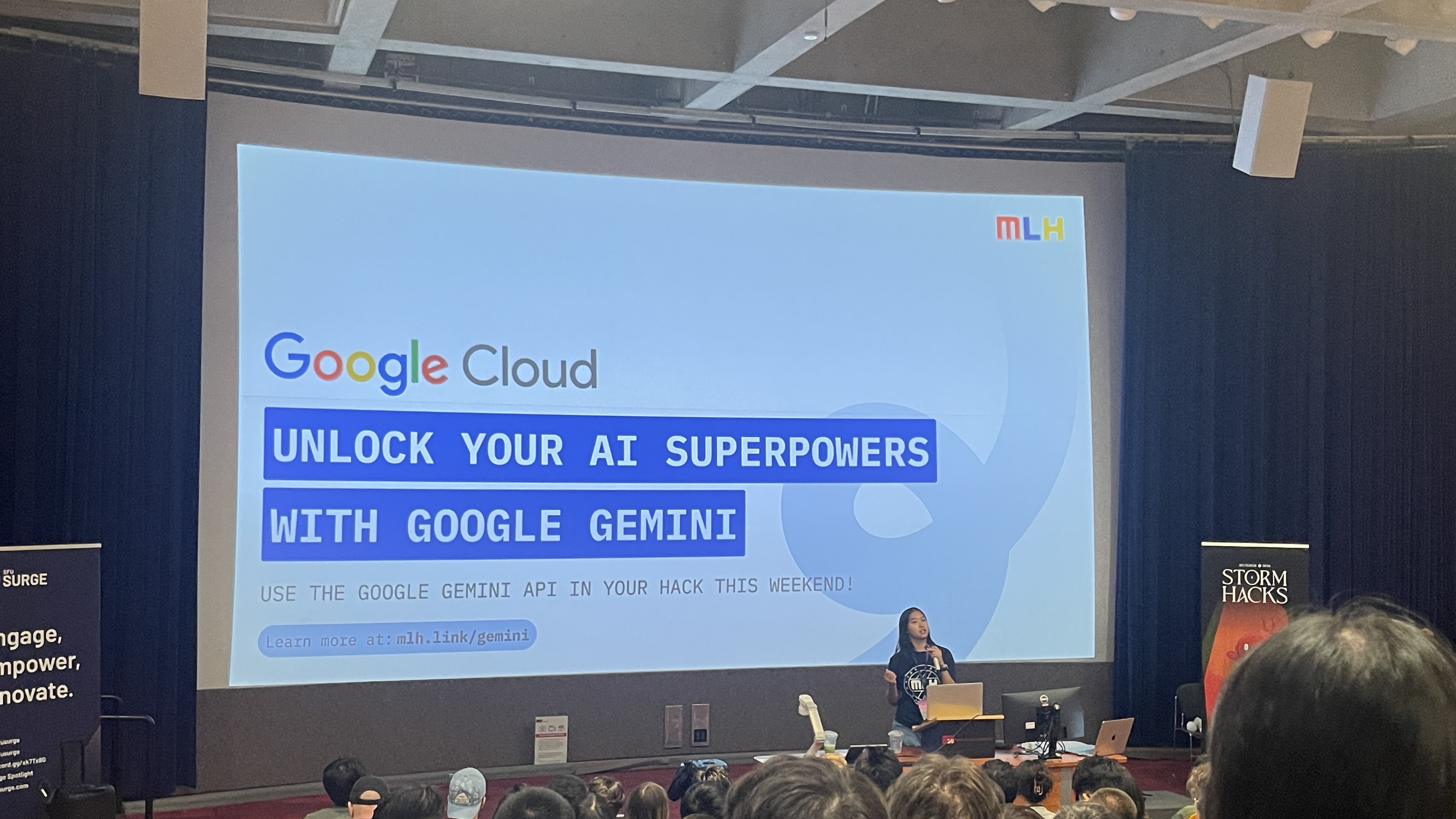
Hackathon Challenge
Build a working subscription management MVP in 24 hours with a small cross-functional team.
A designer–developer pair collaborating in a 24-hour hackathon.
• Designed chat flows and UI rapidly in Figma
• Connected Gemini AI to enable a functional conversational demo
No backend, no real data storage, extreme time limit
• Prototype a conversational UI
• Connect Gemini AI for basic interactions
• Deliver a functional MVP within 24 hours
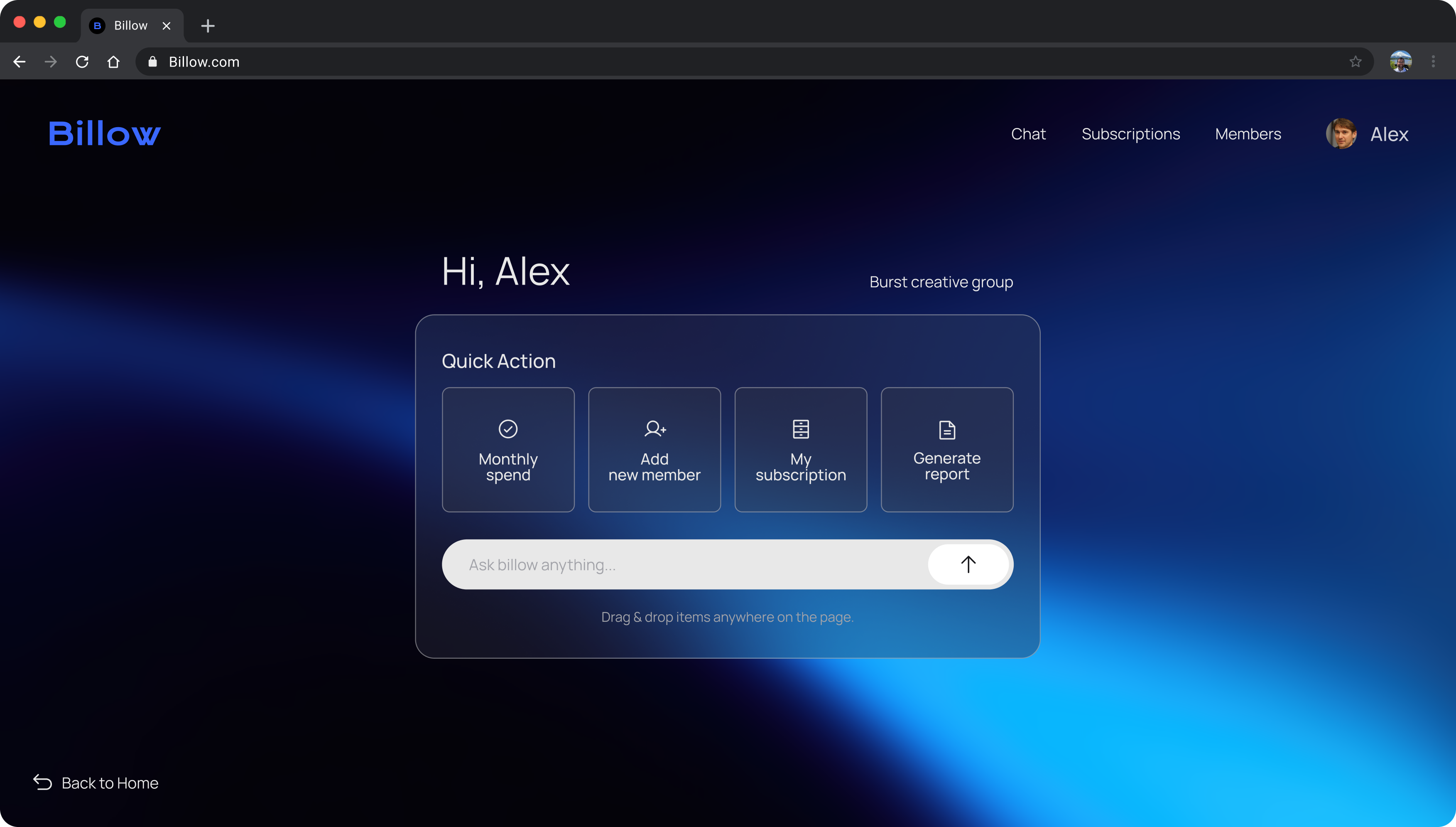
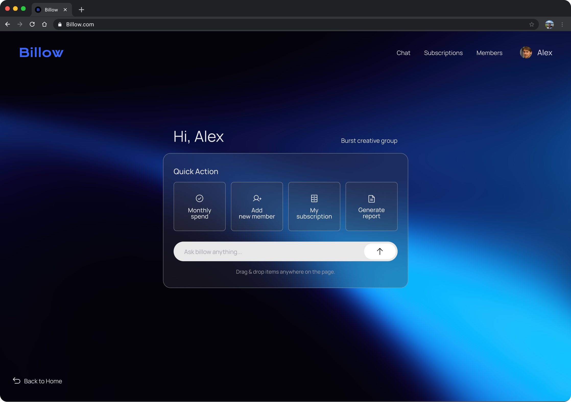
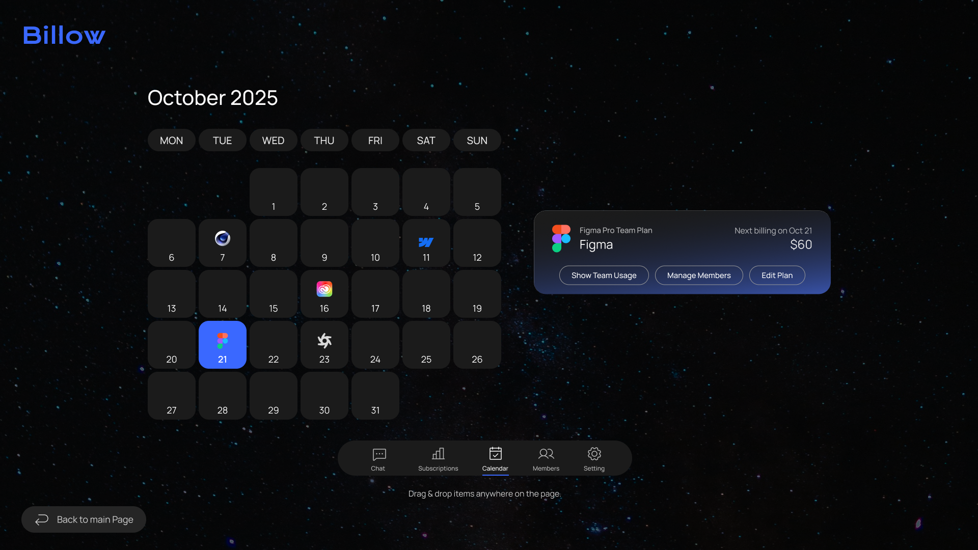
MVP (Minimum Viable Product)
AI guides the entire setup through chat, while quick manual tools handle subscriptions and renewals.

Tasks handled through chat

Suggestions reduce decision time


Drag and drop to auto-setup
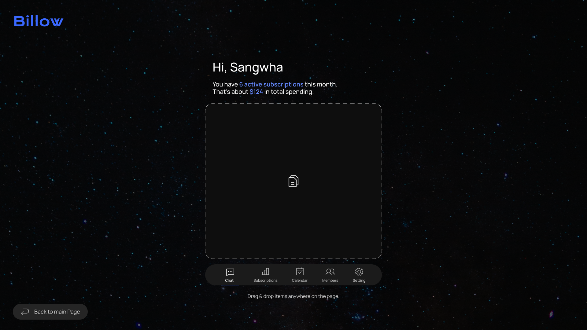

Clear overview at a glance

Quick control of team seats


Billing dates visualized for clarity
Beyond the MVP
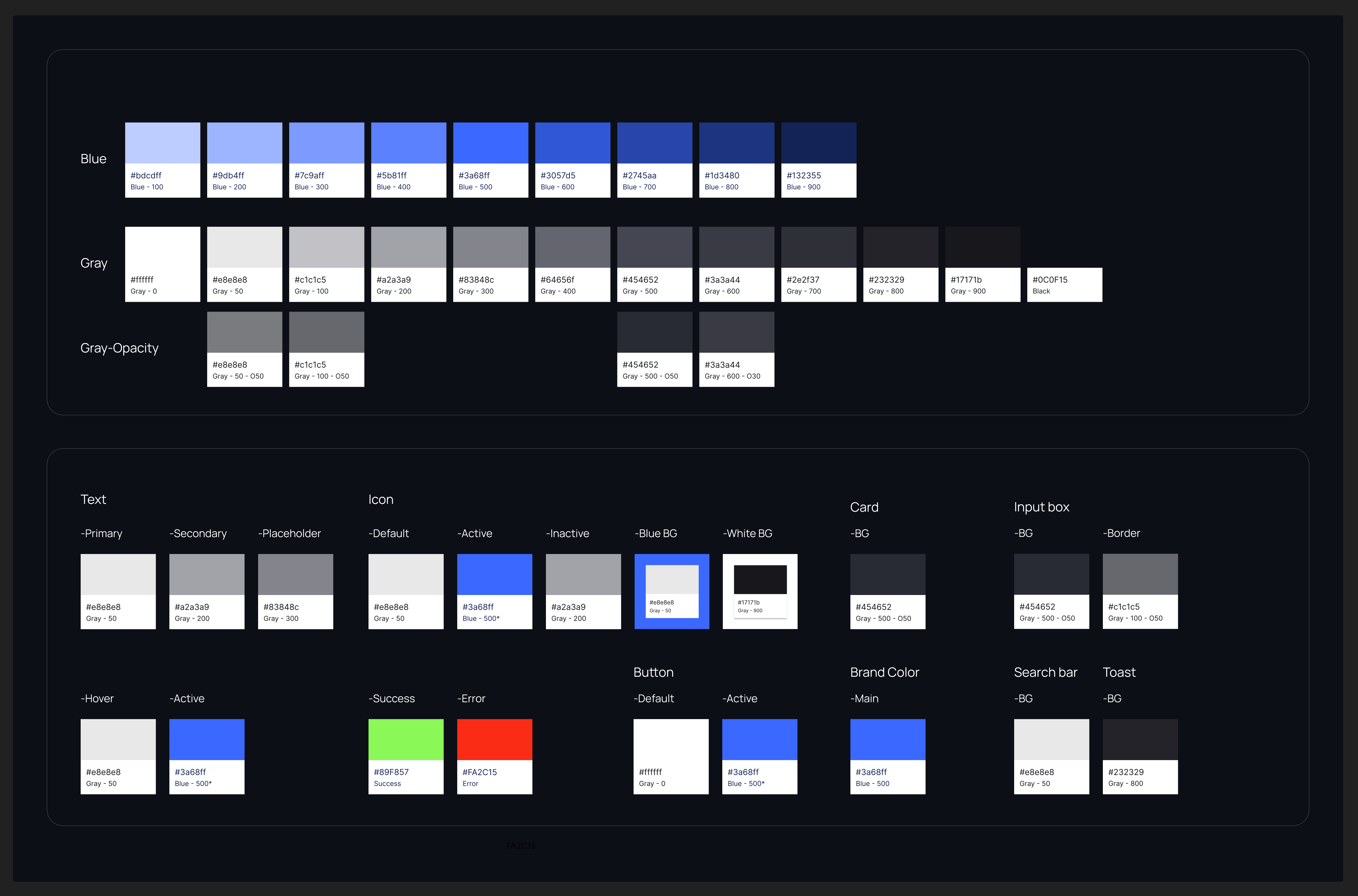
After the hackathon, I expanded the MVP into a scalable UI framework, designed to support collaboration with engineering and future feature growth through consistent visual patterns and reusable components.
Leveraging the new system, I implemented an end-to-end onboarding flow into Billow, powered by AI-guided setup and automated seat assignment.

Alex, HR manager,
opens Billow and registers Lina through the chat. With AI guiding the flow, he assigns the tools she needs in just a few clicks.

Lina, new designer,
is joining the team and needs access to design tools like Figma, Adobe, and Slack.
.svg)
Main Page

Add member in seconds
.svg)
Chat
Enter Lina’s info through chat
.svg)
Assign Seat

AI finds the right seats
.svg)
Canvas View

Progress shown at a glance
.svg)
Members Page Check
Review and add tools instantly
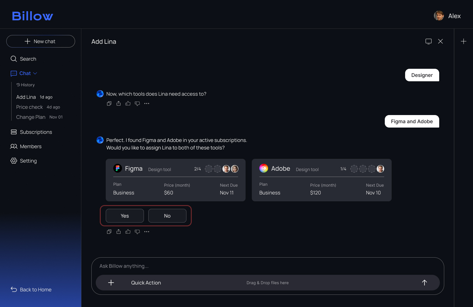
User Testing
1. Expected Behavour
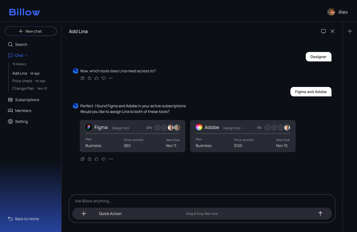
I expected users to approve the tools by responding in the chat once the tool cards appeared.
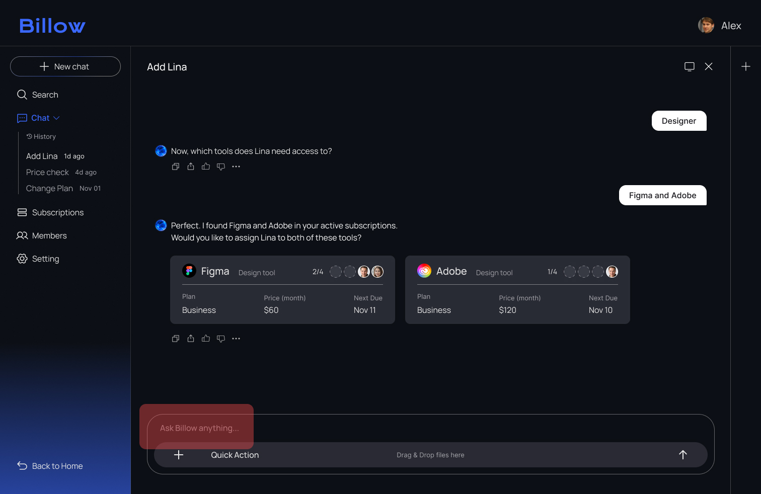
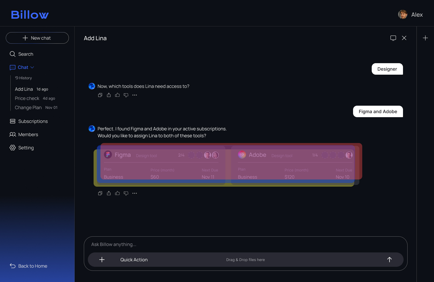
2. What Actually Happened
All three testers assumed the tool cards were interactive and clicked them instead of typing a confirmation. As a result, the onboarding flow stopped because the system was waiting for a chat response.
%201.png)
3. Design Fix
To guide users more clearly, I added explicit Yes/No buttons and a confirmation toast. These changes removed confusion and helped users complete the approval step with confidence.

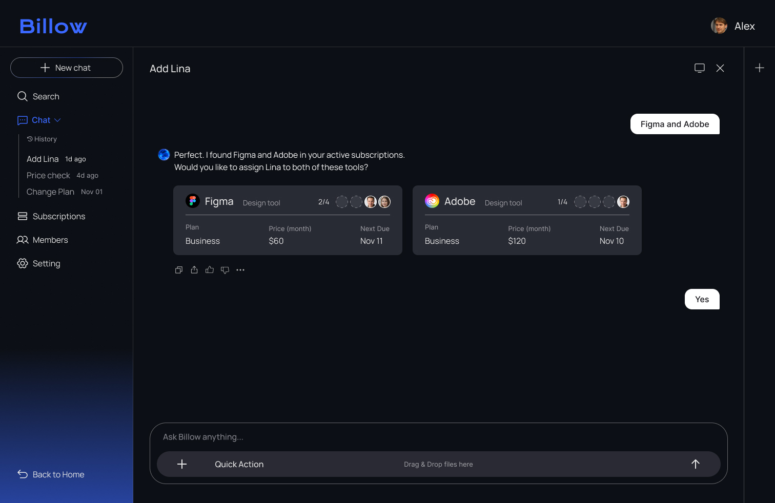
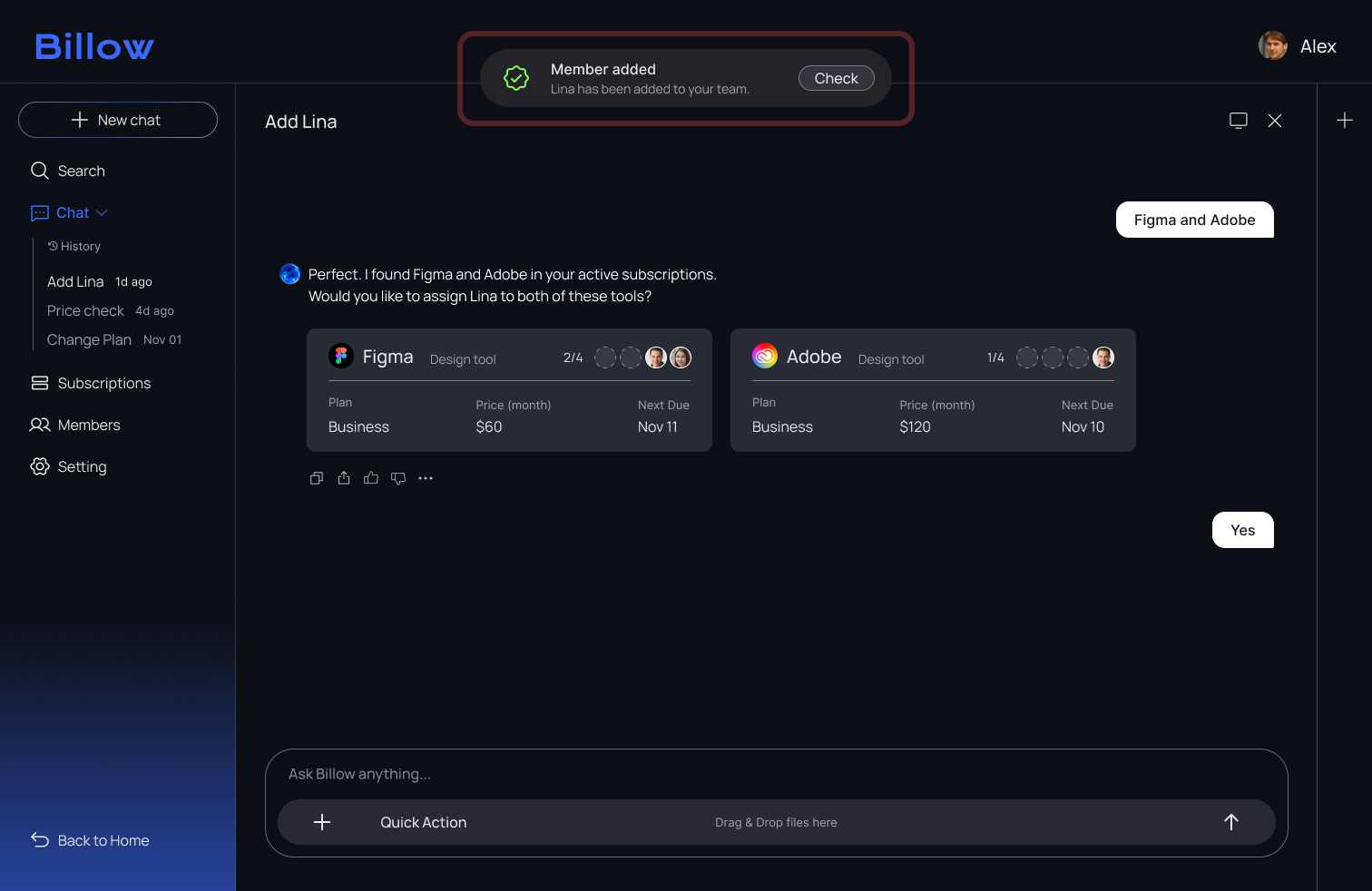
4. Result
After adding clear Yes/No actions, all testers completed the approval step smoothly, without hesitation or misclicks.
Reflection
I learned that the flow I expect and the flow users choose are often different, and user testing is what reveals that gap.
Initially, I prioritized visual simplicity, but observing real behaviour showed that certain guiding elements are essential for user confidence. This process taught me that intuitive design is not just about minimalism. It is about finding the right balance between clean aesthetics and functional clarity.
Furthermore, I realized that creating a system that satisfies both designers and developers is a complex challenge. Bridging the gap between creative vision and technical feasibility requires constant alignment. I learned that a truly intuitive system is not built in isolation. It is the result of deep collaboration to ensure the final product is as robust as it is beautiful.