Managing subscriptions became a conversation
Teams worked across multiple SaaS tools.
Managers had to ask people to understand usage.
1. Unused seats stayed active
2. Renewals were missed
3.Time was lost navigating admin panels
Information was distributed across tools. Managing it meant visiting each one separately.
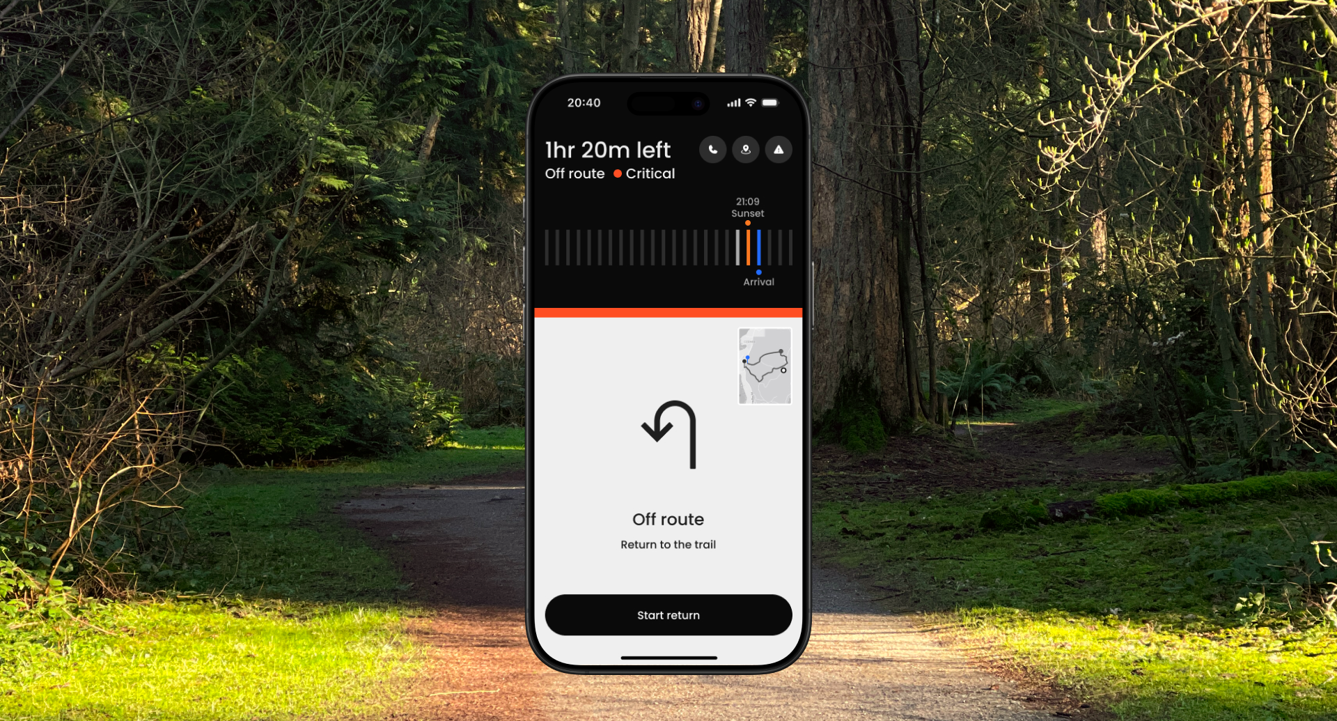
Actions start in conversation. Confirmation happens in the dashboard.
Routine tasks shouldn't require switching tools.
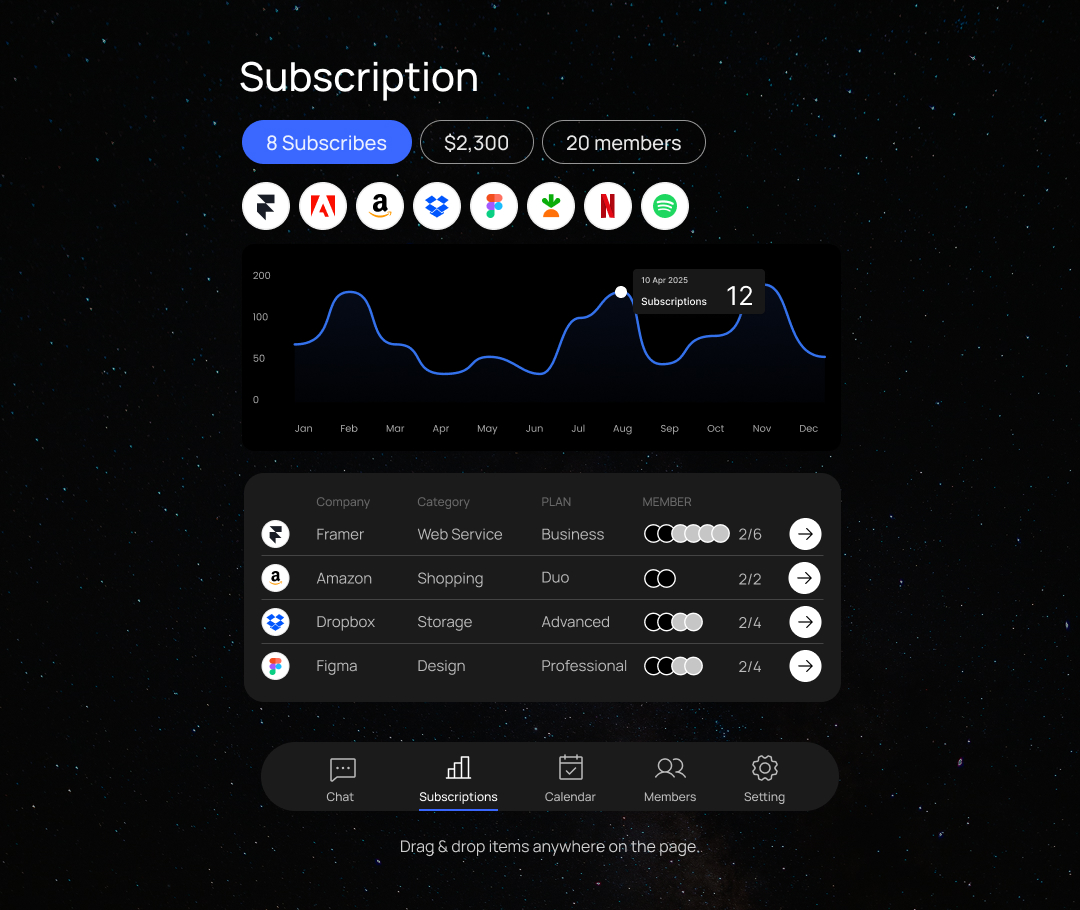
Teams could manage subscriptions without learning each tool. The concept expanded into a scalable operational UX system.
Hackathon Challenge
Build a working subscription management MVP in 24 hours with a small cross-functional team.
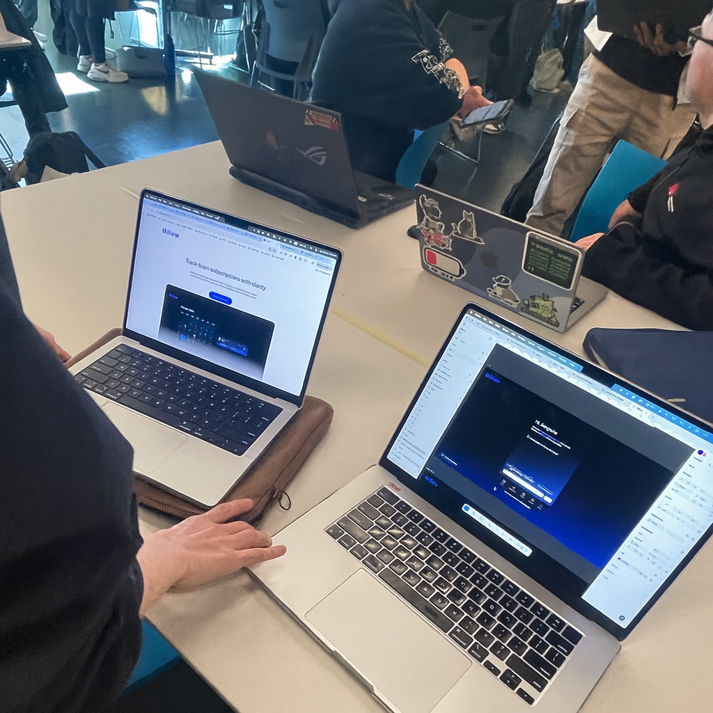
A designer–developer pair collaborating in a 24-hour hackathon.
• Designed chat flows and UI rapidly in Figma
• Connected Gemini AI to enable a functional conversational demo
No backend, no real data storage, extreme time limit
• Prototype a conversational UI
• Connect Gemini AI for basic interactions
• Deliver a functional MVP within 24 hours
Context
The problem wasn’t forgetting. Subscription management was fragmented across multiple service interfaces.
After an employee left, their licenses kept being paid for months because the process depended on whoever managed it before.
Problem
Teams lose visibility over subscriptions, leading to missed renewals, unused seats, and unexpected costs.

Understanding the problem
.svg)
.svg)
Understanding the behavior
and no one had the full picture.
I surveyed 12 people who regularly use paid software tools about how their teams handle subscriptions. People only knew the subscriptions relevant to them, and no one had a complete view.


It was the reliance on memory instead of shared visibility.
What the product needed to do
This led to three design rules:
Turning assumptions into an MVP


From MVP to a System
The concept worked, but it didn’t scale. So I defined UI rules and built a reusable system future features could grow from.
This led to three design rules:


Beyond the MVP
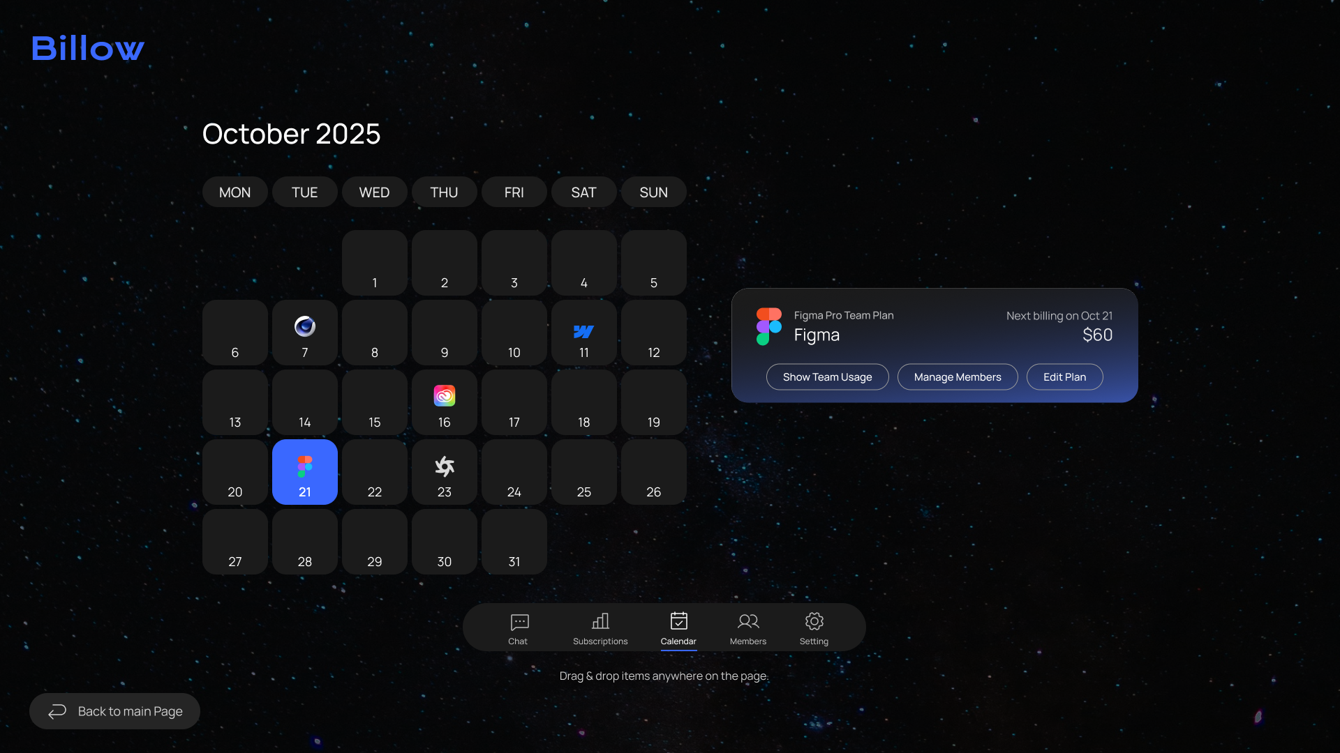
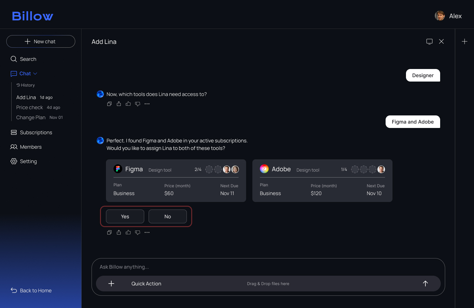
Leveraging the new system, I implemented an end-to-end onboarding flow into Billow, powered by AI-guided setup and automated seat assignment.
Story

Alex, HR manager,
opens Billow and registers Lina through the chat. With AI guiding the flow, he assigns the tools she needs in just a few clicks.

Lina, new designer,
is joining the team and needs access to design tools like Figma, Adobe, and Slack.
.svg)
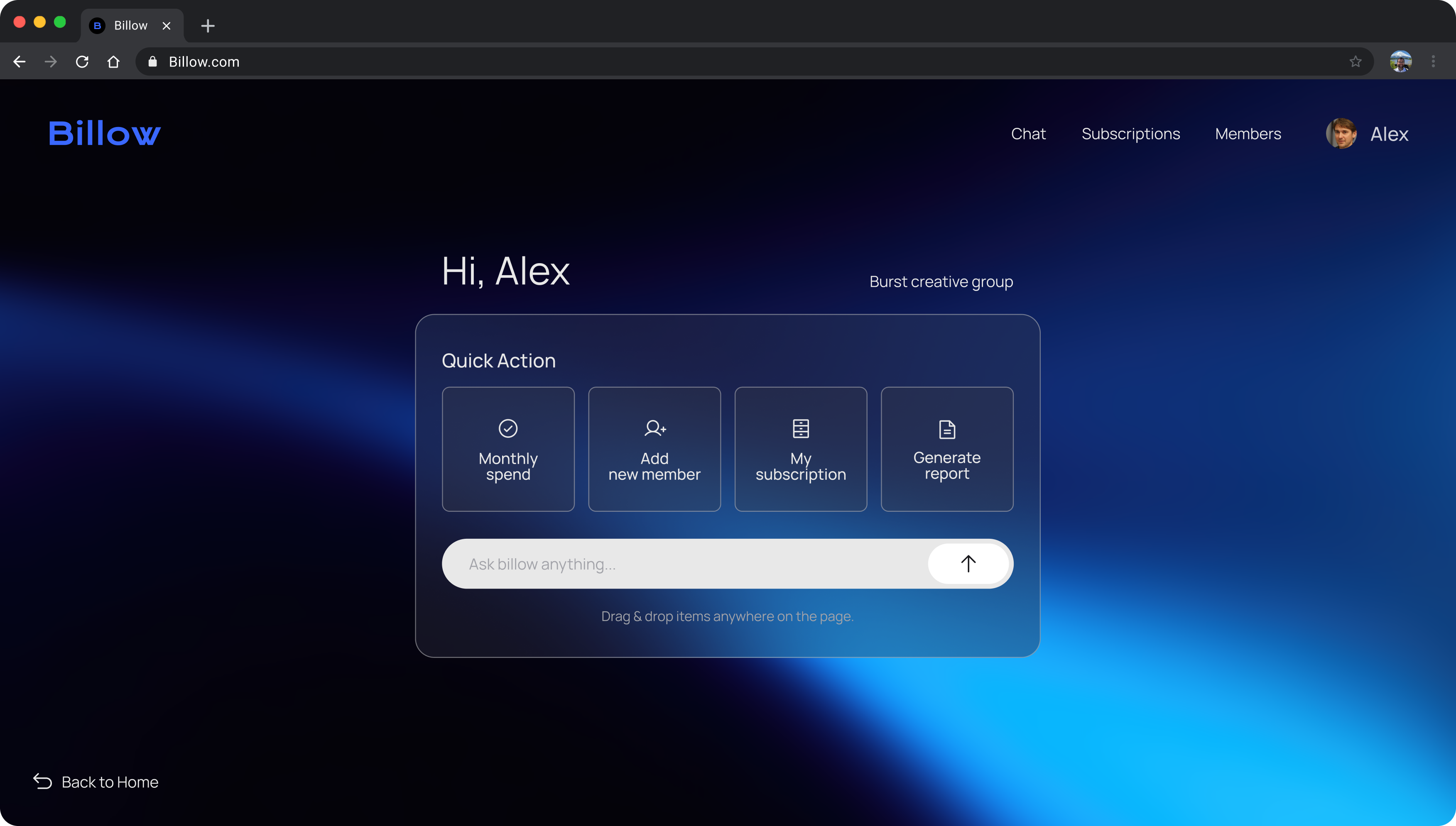
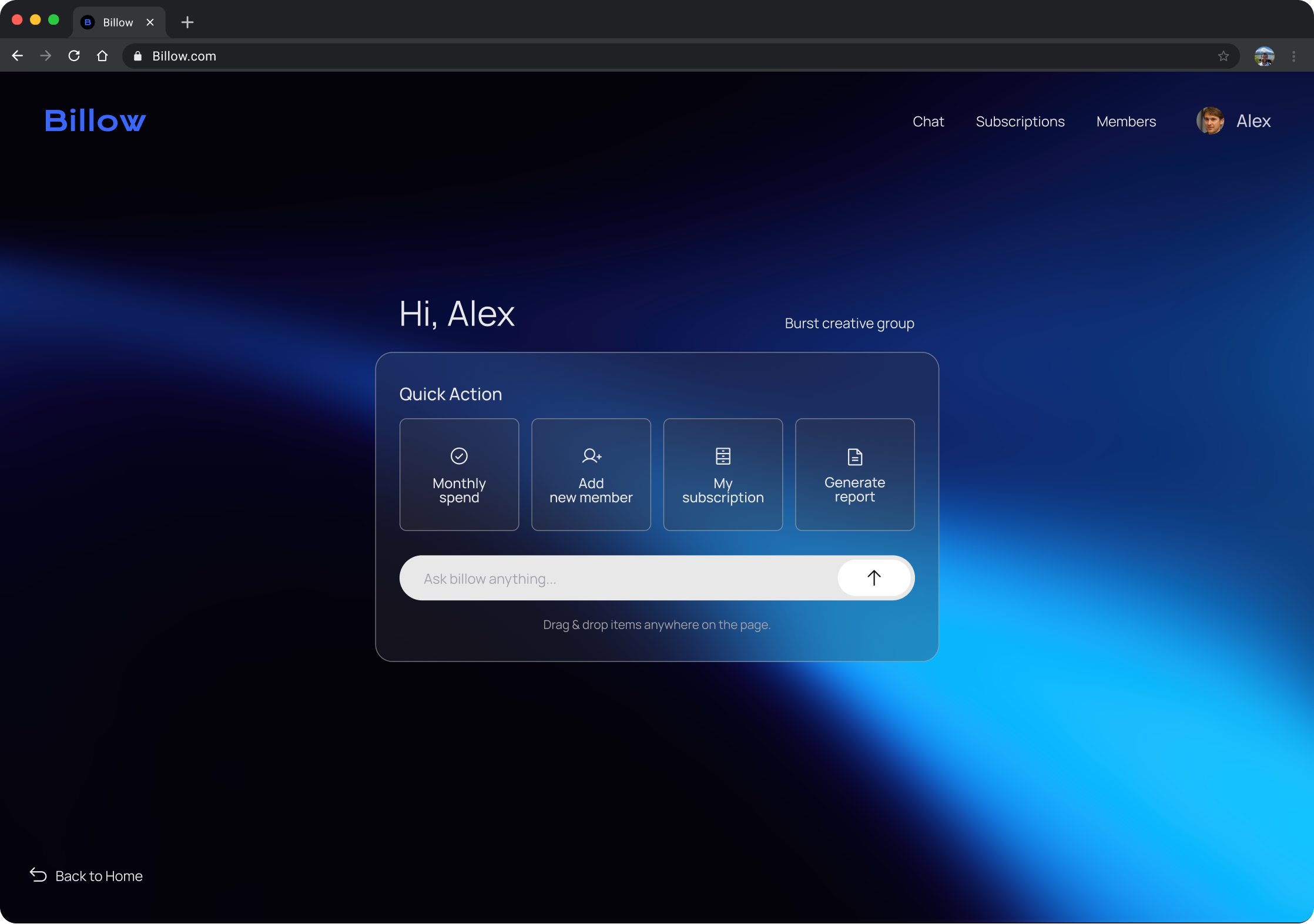
Main Page

.svg)
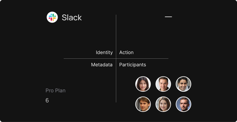
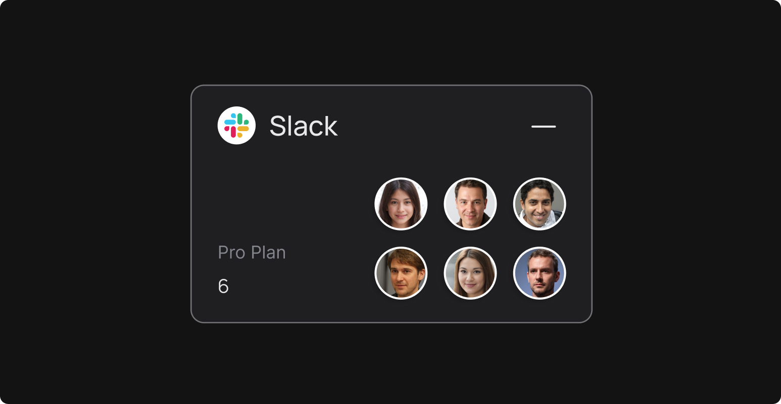
Chat
.svg)
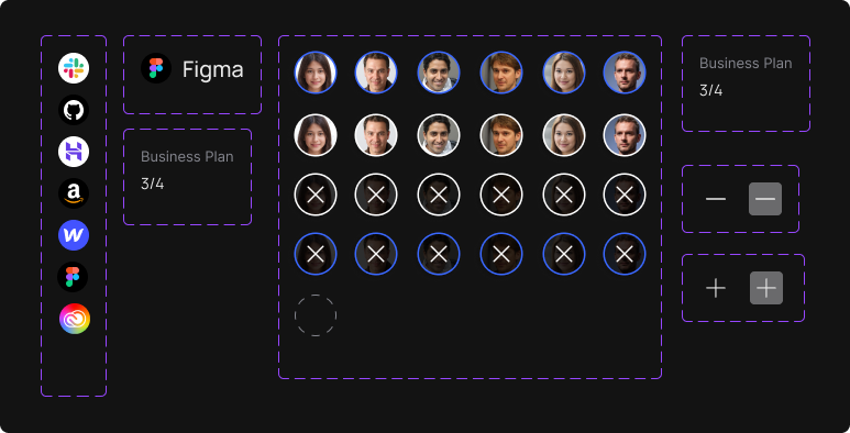
Assign Seat
.svg)
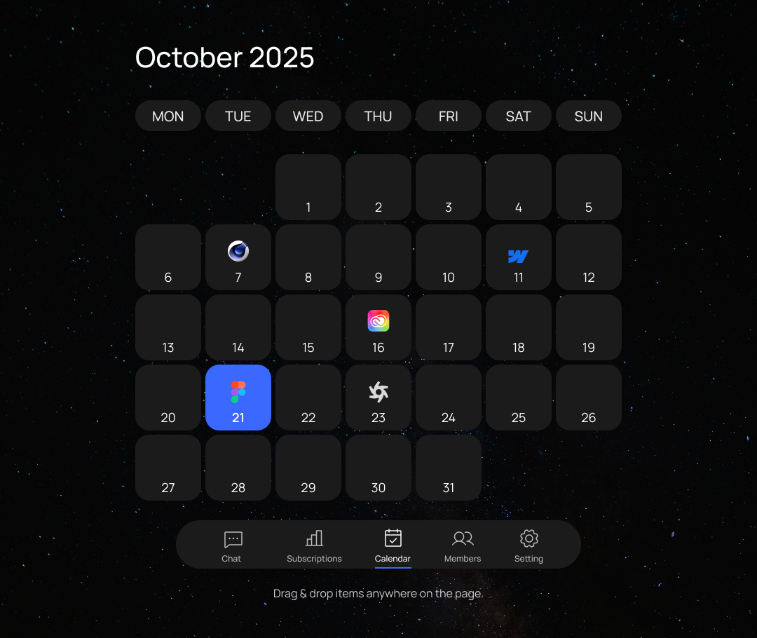
Canvas View

.svg)
Members Page Check

User Testing
I expected users to approve the tools by responding in the chat once the tool cards appeared.
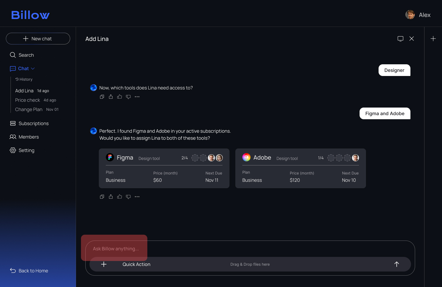
All three testers assumed the tool cards were interactive and clicked them instead of typing a confirmation. As a result, the onboarding flow stopped because the system was waiting for a chat response.
%201.png)
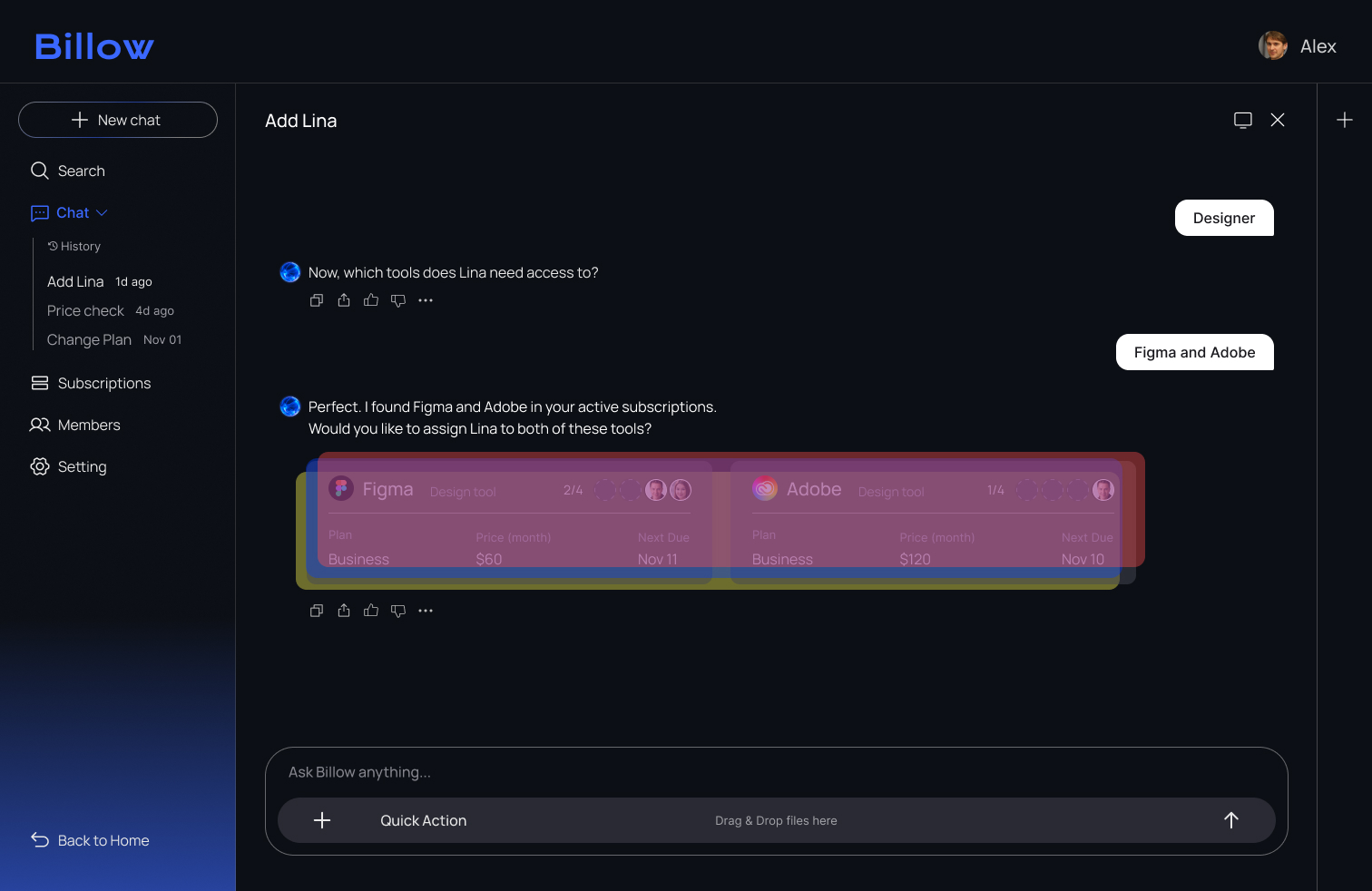
To guide users more clearly, I added explicit Yes/No buttons and a confirmation toast. These changes removed confusion and helped users complete the approval step with confidence.

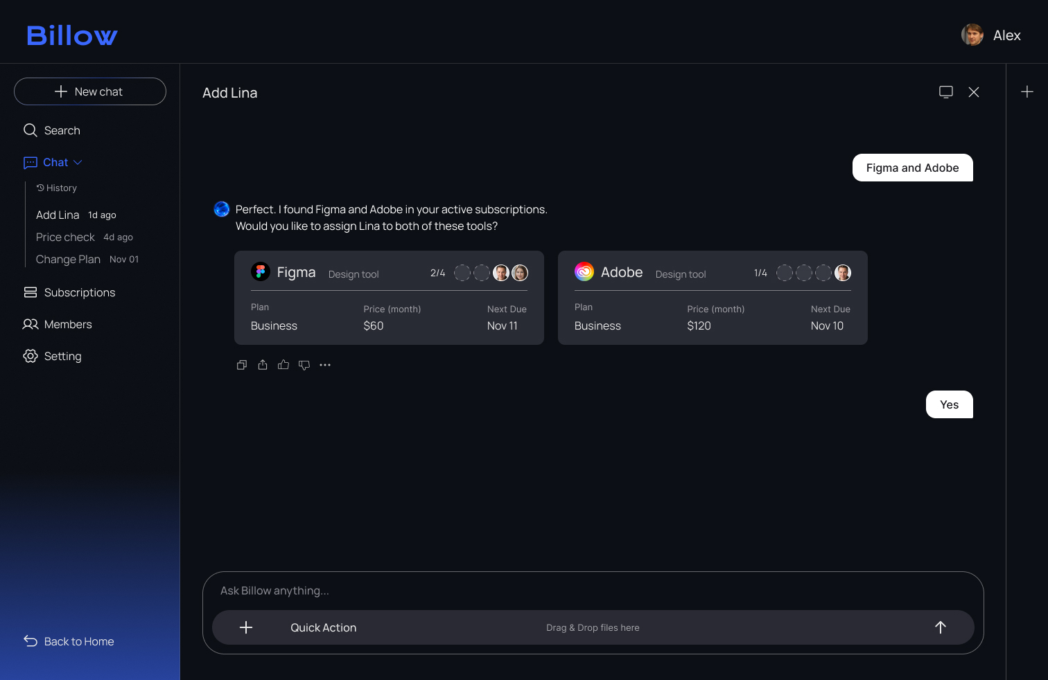
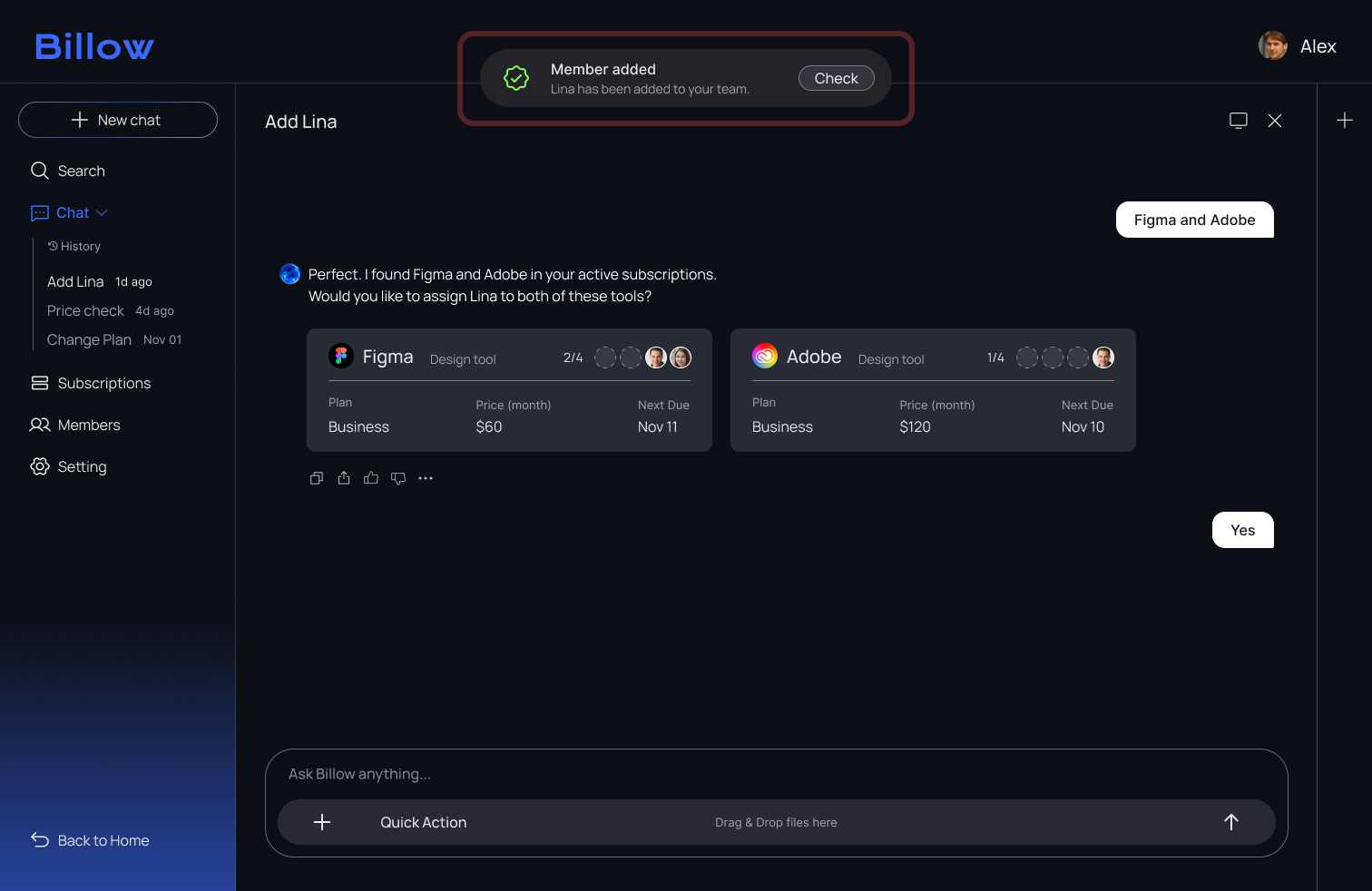
After adding clear Yes/No actions, all testers completed the approval step smoothly, without hesitation or misclicks.
Reflection
.svg)
Users did not want to explain everything in chat. When the outcome had to be clear, they trusted selecting an option more than writing a message. Simple choices like yes or no felt faster and more reliable, so I shifted the interaction toward reassurance before action.
.svg)
The goal wasn’t visual clarity alone. Users hesitated before taking action, so I changed the interaction pattern to give them confidence earlier.
.svg)
Design handoff was difficult because alignment takes effort, not UI complexity. I collaborated with developers early to define how actions, states, and responsibilities work across the system so it could scale clearly.