
Velot
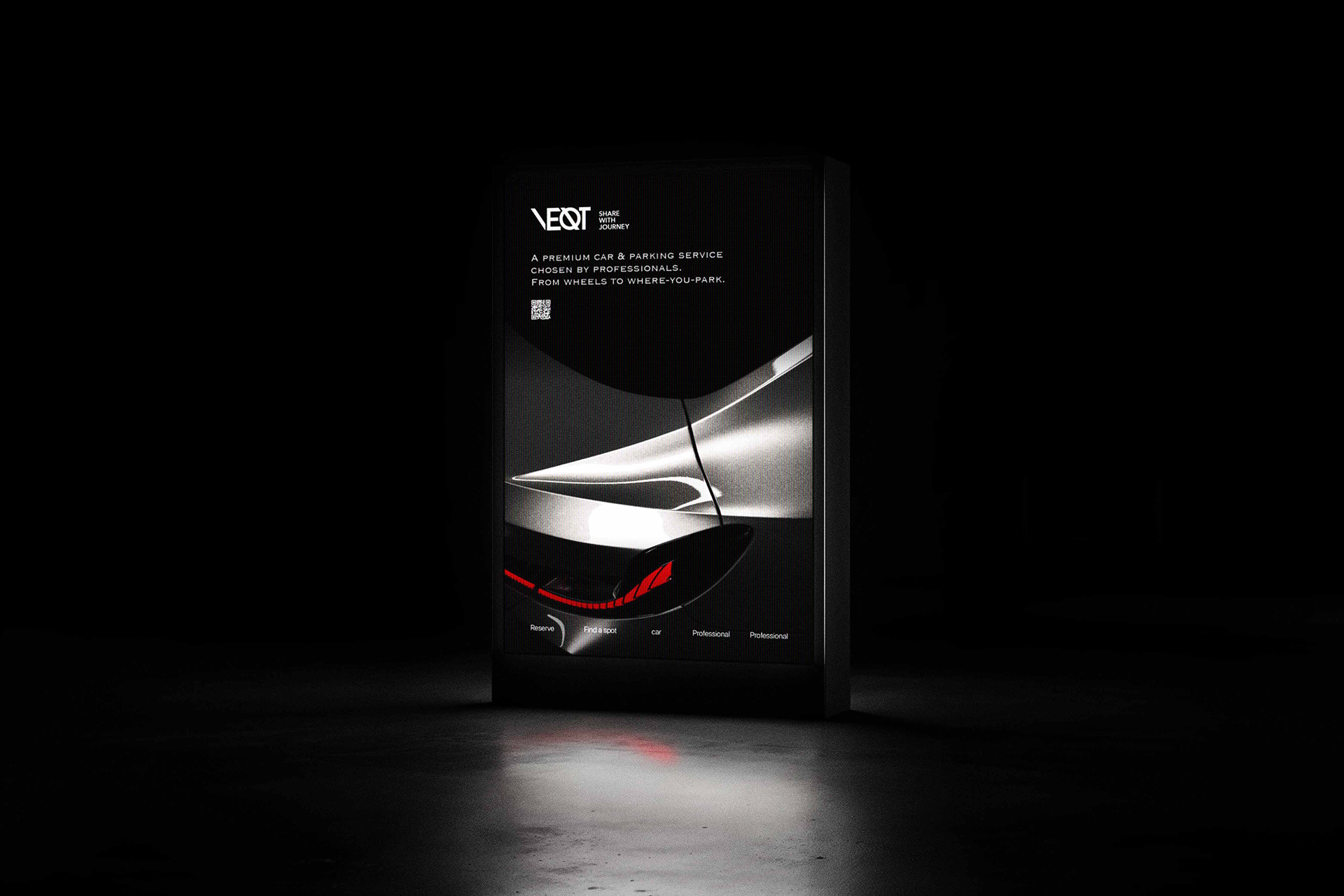
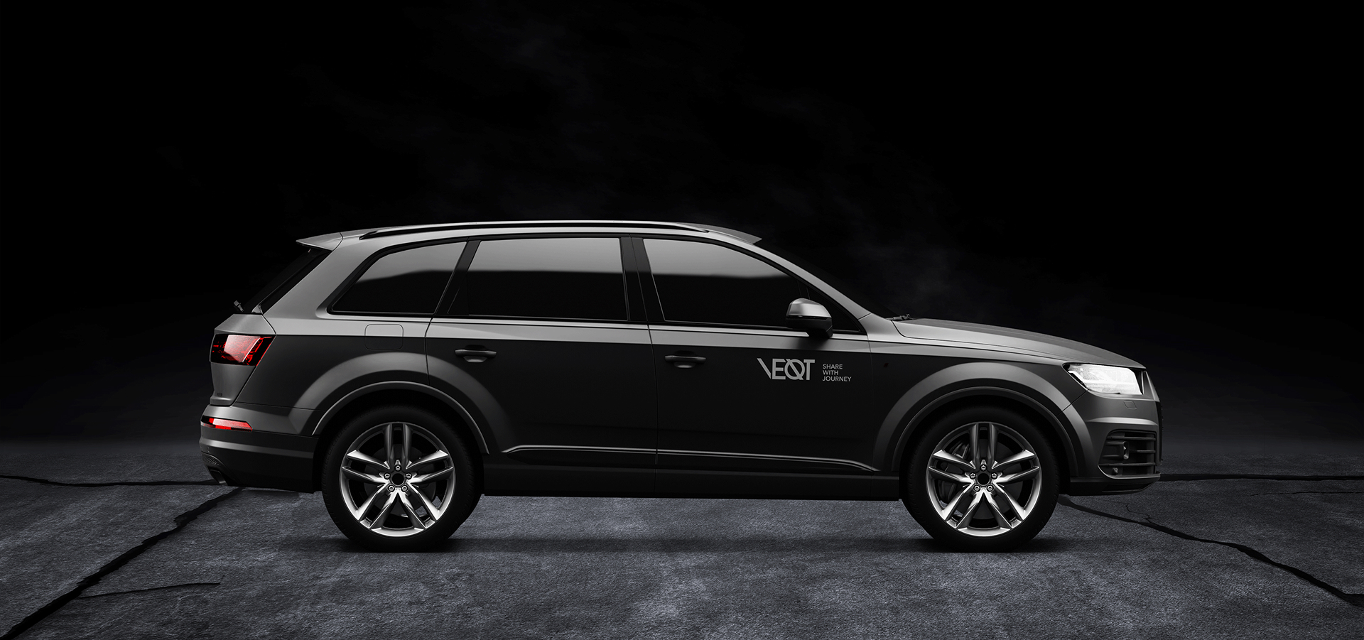
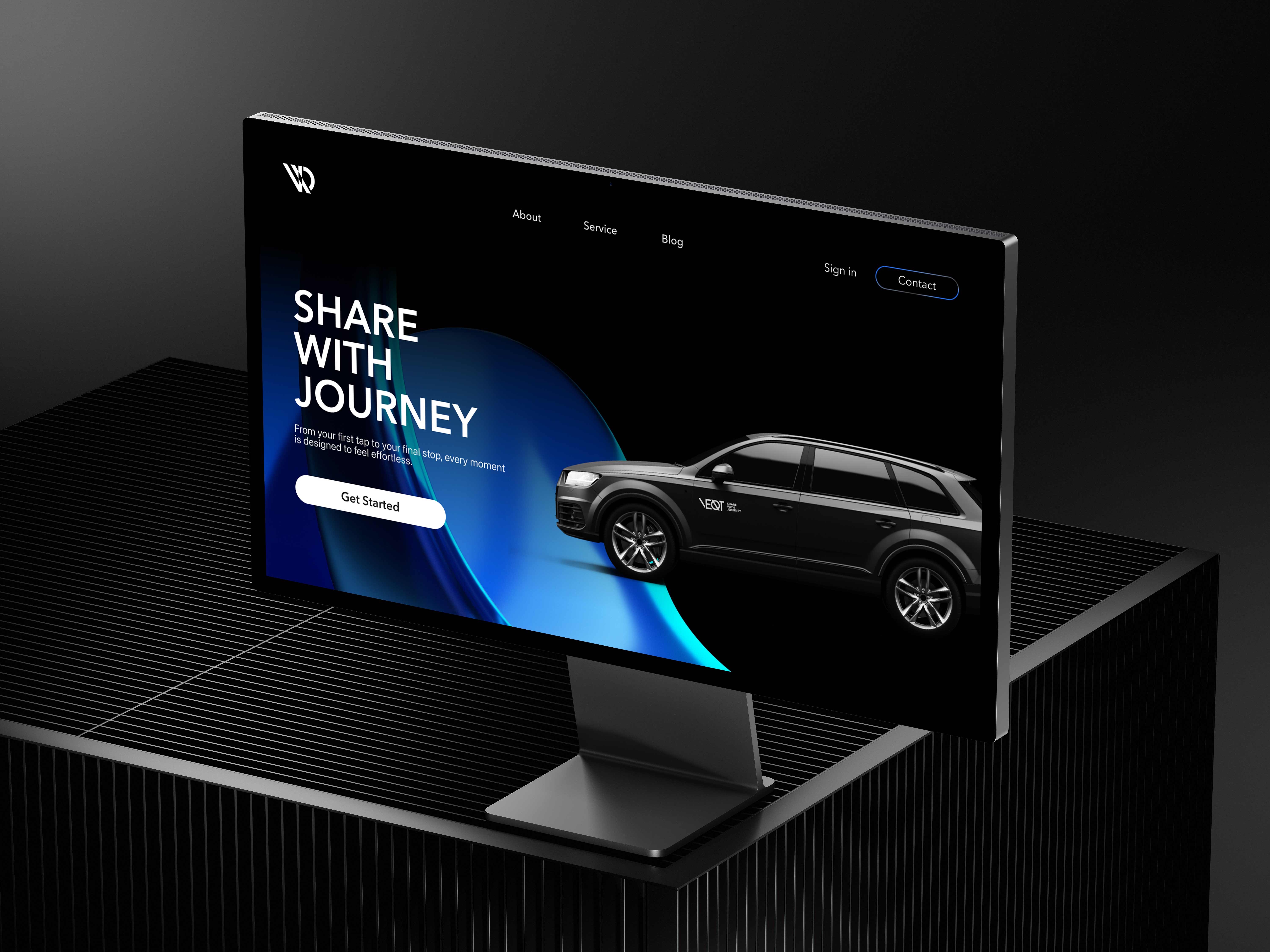
Velot is a car-sharing brand that goes beyond movement. It covers the full journey, from driving to parking, offering a seamless mobility experience for modern urban life.
Role
Timeline
Team
Tool


Brand Story
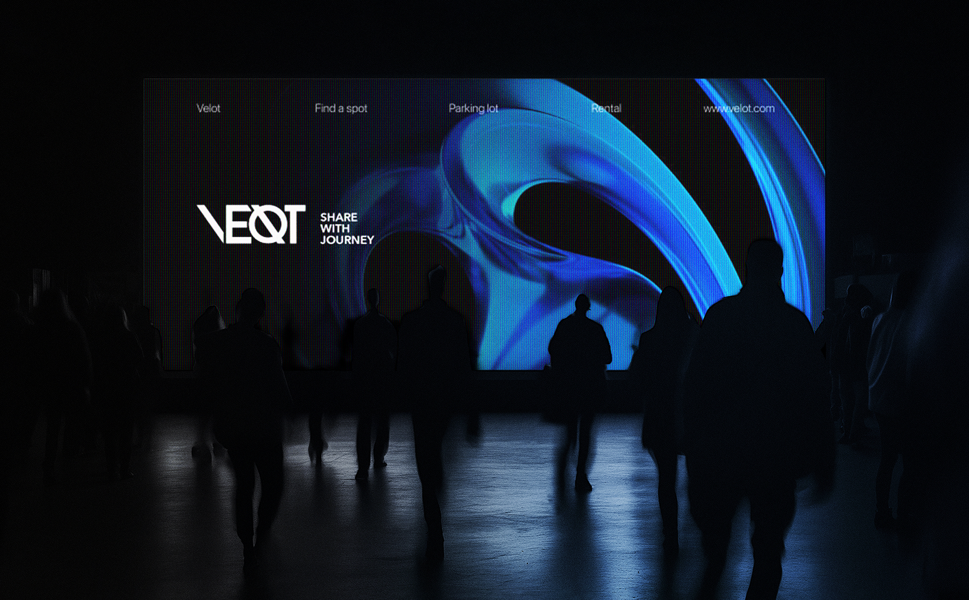
Urban driving doesn't end when you stop the car. The moment between motion and stillness became the starting point for Velot's brand identity, shaping everything from the logo to the visual language.

Approach
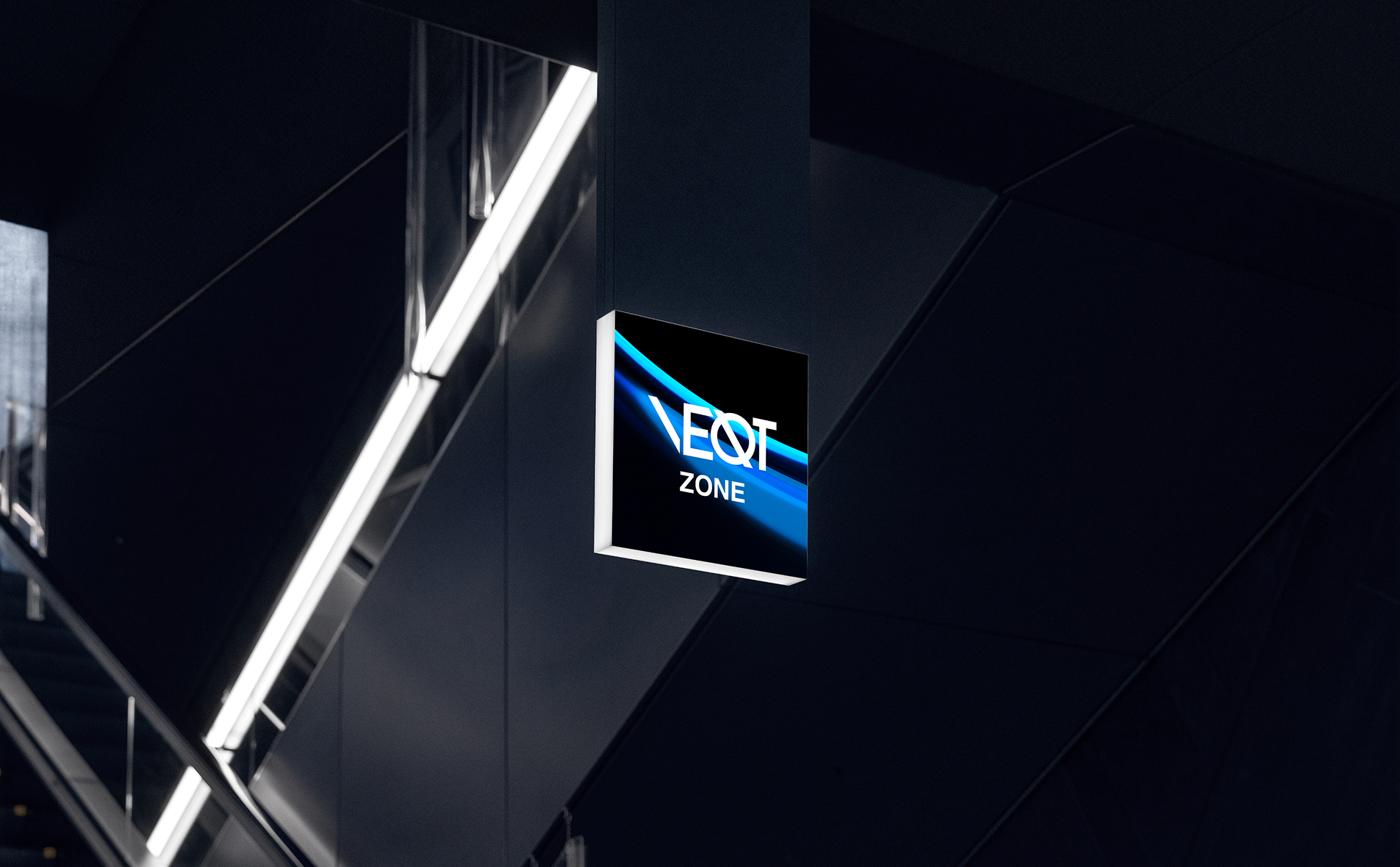
The logo draws from visual cues found in everyday driving, parking lines, curved roads, and intersecting lanes. These elements were simplified into geometric forms that reflect the shift from driving to parking.


Visual Identity
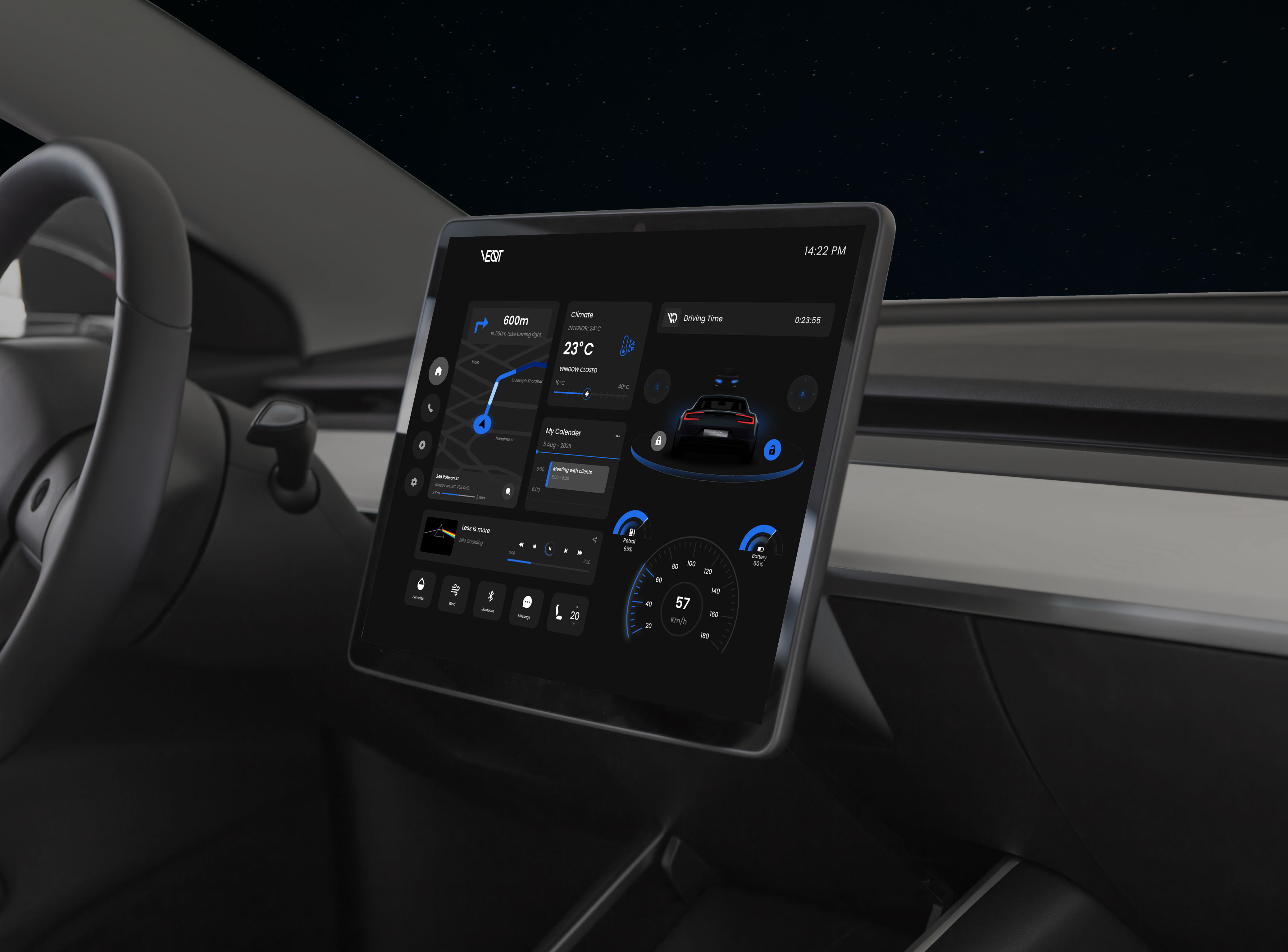
The visual identity is built on contrast and clarity. A deep black base, signature blue for energy, and soft white for balance, paired with Avenir Next for its clean geometric character.

Signature Visual
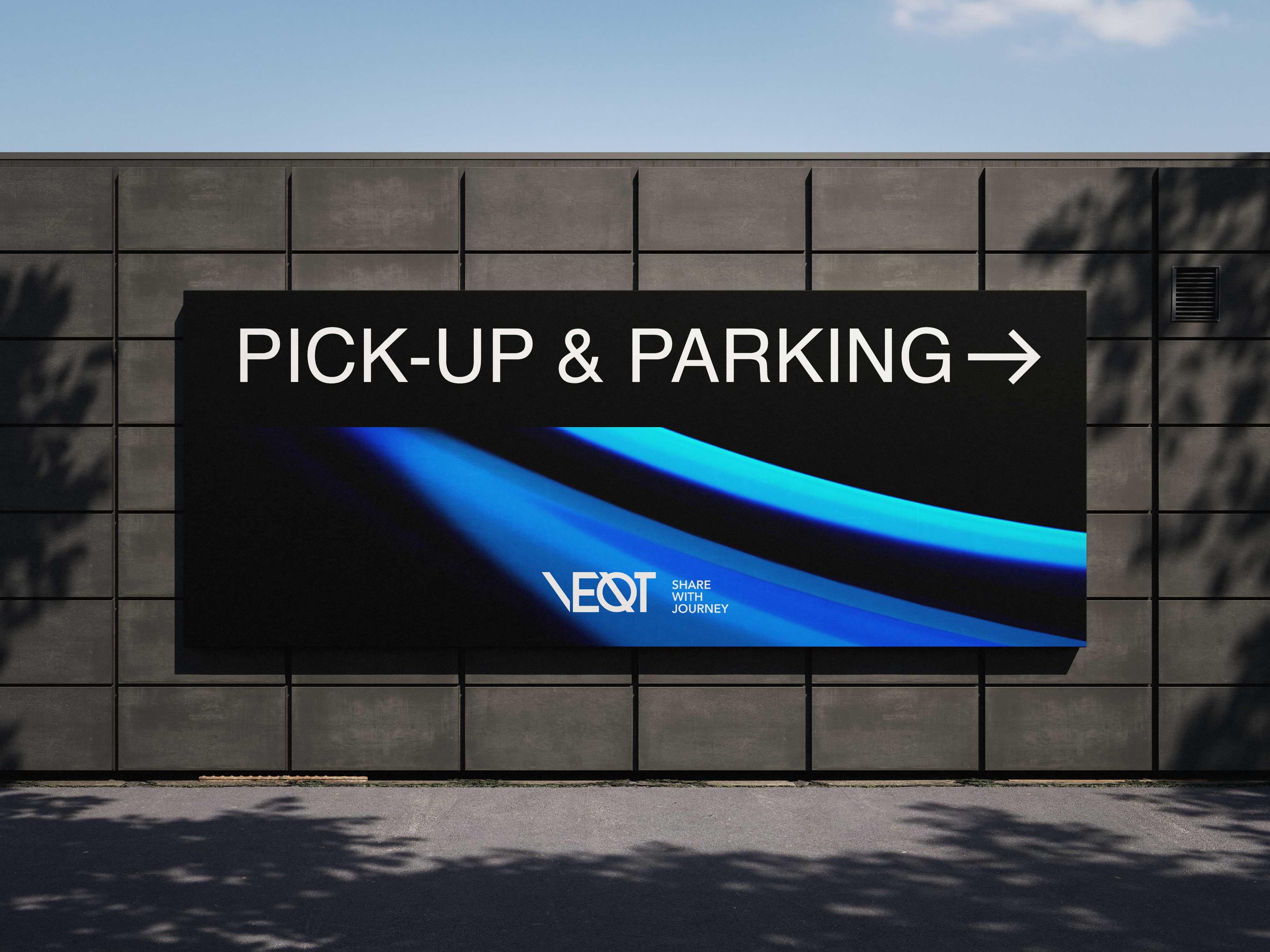
The core concept, from motion to stillness, is expressed as a fluid, dimensional form. This visual runs across all brand touchpoints as the signature graphic.